
Skillshare Reveals Bright New Brand Identity To Visualize The Creative Journey
Images via Skillshare
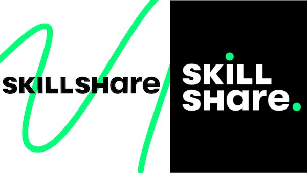
On New Year’s Day, creative online education platform Skillshare unwrapped a new visual identity that illustrates creative discovery, fulfillment and the destination.
The online learning community’s previous logo of two hands coming together depicted information being exchanged. Almost a decade on, “Skillshare is so much more,” the company details in a blog post.
Posted by Skillshare on Wednesday, February 29, 2012
“We encourage the curious and the creative to make discoveries about their passions, their abilities, and themselves—and to connect with a supportive community of millions in the process,” it writes. “We’ve seen again and again how the seemingly simple act of creating can be a force for growth, change, and discovery in people’s lives.”
To capture this evolution, the redesigned visual identity “leans into our belief that exploration makes discovery and fulfillment possible—that the journey is the destination,” Skillshare explains.
Skillshare admits that its previous wordmark wasn’t compatible on all digital screens. The new one was therefore designed with legibility in mind, and can be adapted to fit various sizes and orientations.
Image via Skillshare
Posted by Skillshare on Thursday, January 2, 2020
Dots added to the ‘i’ and as a full stop highlight “key points along a journey” and the fluidity of the creative process—“there’s no defined beginning or end.”
Skillshare also included a mix of uppercase and lowercase characters in the wordmark to encourage experimentation and to “keep it weird.” Also, since it’s difficult to tell geometric sans serif logos apart, the platform played around with the letterforms to express its individuality.
A new primary color called Wander Green takes inspiration from the traffic light and “gives permission to start, go,” as well as urges members to go ahead and “be your authentic self.” In the classical sense, green is a hue for growth, wisdom, intelligence, confidence and freshness. The added brightness helps Skillshare stand out in the digital realm.

Image via Skillshare
Skillshare further illustrates “finding yourself” by adding varying shapes that portray lines and meandering paths to its branding.

Image via Skillshare
“The lines don’t have a beginning or an end because your journey is endless and evergreen,” the brand explains. They’ll also be animated in certain instances to illustrate enlightenment and excitement.
Skillshare has rolled out its new visual identity across its channels. Read more about it here.
Image via Skillshare
[via Skillshare]
Also check out these recent news


