
Google Maps Drops The Map In Colorful Logo Makeover For 15th Birthday
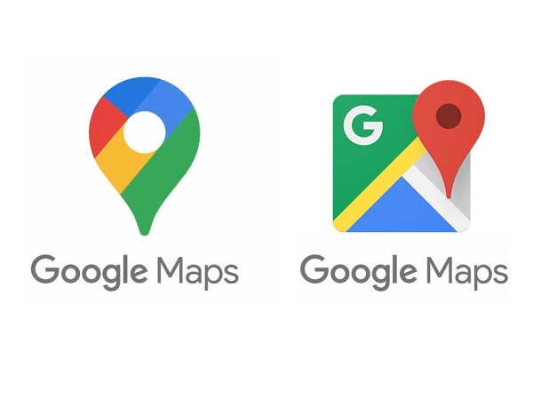
Left: New Logo | Right: Old Logo
Google Maps is getting a design overhaul in celebration of its 15th birthday.
The app icon is getting a new look that resembles a pin. Previously, the logo took on the form of a map.
According to Google’s blog post, the redesign will put greater emphasis on discovery and recommendations along with three new tabs at the bottom of the screen that read ‘Saved’, ‘Contribute’ and ‘Updates’.
The ‘Saved’ button includes bookmarks of places you have gone to or wish to visit. The ‘Contribute’ tab encourage users to share reviews and photos and help update details of businesses and locations that could aid other customers, while the ‘Updates’ button provides information about “trending” or “must-see spots.”
Google Maps will also introduce transit information that lets you know how crowded public transportation services might currently be.
The refreshed app will roll out across iOS and Android devices on Thursday.
Can’t remember the name of that amazing coffee shop from your last trip?
— #GoogleMaps15 🎈 (@googlemaps) February 5, 2020
With Timeline, you can rediscover all the places you went - and create a list of your favorites. Available now on iOS. 🕔 pic.twitter.com/LtOMPN8oOT
We’re celebrating our 15th birthday with a fresh look.
— #GoogleMaps15 🎈 (@googlemaps) February 6, 2020
A new icon and everything you need at your fingertips with five helpful tabs, rolling out starting today on Android and iOS. https://t.co/EE3dTV5Vno #GoogleMaps15 pic.twitter.com/5WzgeEuv04
[via Google, opening image via Google]
Also check out these recent news


