
Uber Redesigns App With Look Inspired By Public Transport Design
Images via Uber and Shutterstock
Uber is going down a whole different route for inspiration behind its app design—public transport—for a friendlier, universal and easier-to-use interface.
The muse is unexpected and yet an ingenious one. Apart from Uber’s obvious association with transport, mass transit systems around the world have undergone significant changes throughout the years for the people. Picking up on their best practices allows for a more intuitive redesign that users are already familiar with.
A new trip tracker zeroes in on visual nuances to show relevant trip information, such as ride and location details. To avoid stressful trips, Uber’s design team eliminated several text notifications, which could block its map, replacing them with icons indicating updates like traffic changes and delays.
The important text, on the other hand, has been blown out. Drivers’ license plate details are now 70-percent larger, with an informational card at the bottom increasing in size by 32 percent.
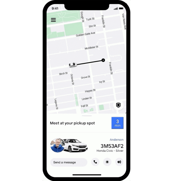
Image via Uber
A “ticker” feature also includes a blue square flipboard icon serving as a countdown to the driver’s arrival, and an “arriving now information card” that displays relevant information about the ride including the driver’s name and rating. In addition, users are now given instructions to meet their drivers in large public spaces like airports.
The makeover comes after a recent audit that found“a lot of opportunity” in simplifying the Uber app for users, Uber’s senior product designer Selwyn Kancharla told Fast Company. Just like mass transit, Uber’s service offerings expanded over the years, and it had to find a way to streamline all of that.
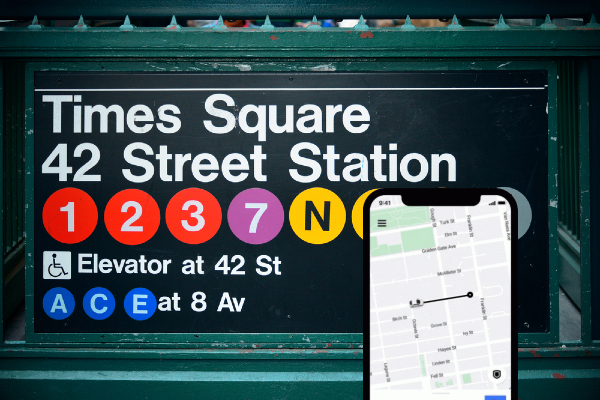
The final design was the result of “thousands” of iterations, and draws upon signage and iconography from international airports and transport systems. These include the color-coding in New York City’s subway kiosks, and the designs of San Francisco’s Muni and Hong Kong’s MTR for universally-legible iconography “with minimal text.”
As with public transport, “our technology needs to fit around customers’ lives, not the other way around,” Kancharla explained.
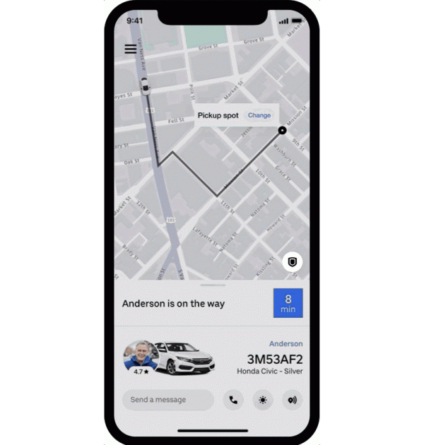
Image via Uber
[via Fast Company, images via Uber]
Also check out these recent news


