
PANTONE Introduces 315 New Colors & New Organizing System To Aid Creatives
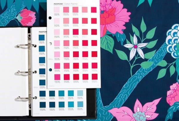
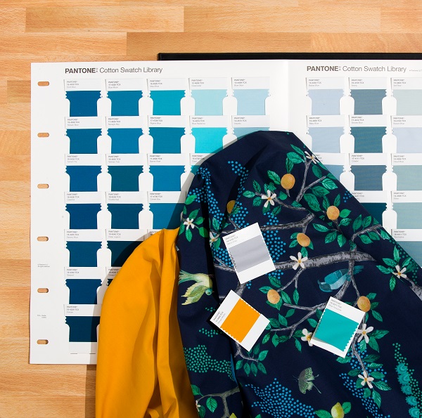
PANTONE has expanded its color library by adding 315 new colors, 70 new blue shades and 50 pink hues, bringing a total of 2,625 colors.
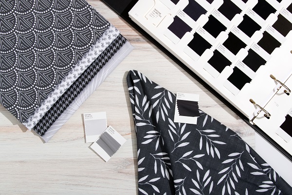
It has also redesigned its color guides and placed a new organizing system to “streamline workflow in digital and real-world design processes.” PANTONE has additionally enhanced the utility of its PANTONE Fashion, Home + Interiors Color System, ensuring that the design community can find and choose colors with precision.
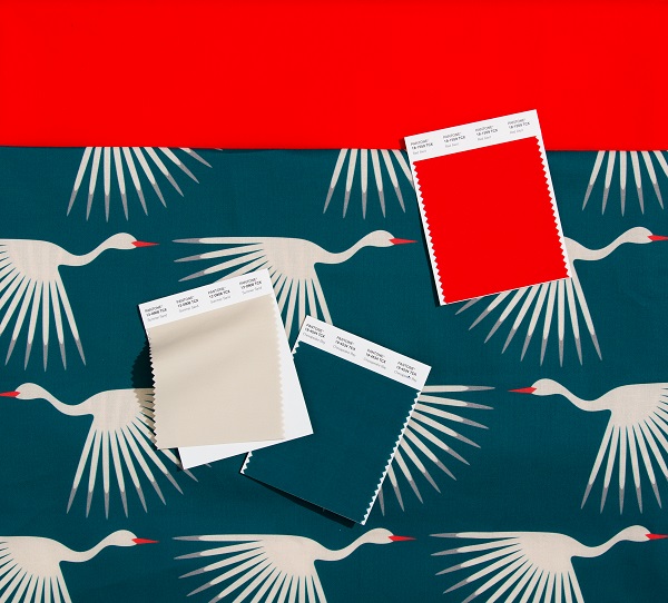
As “traditional understanding of reds continues to broaden,” the new shades include Fire Whirl, Adrenalin Rush and Watermelon, which represent “protest to statement to individuality.”
Pink, which has “embraced new meanings beyond its child-like status,” has been added with paler hues such as Sangria Sunset and Viva Magenta. Joining the blue library are Endless Sky, as well as Ebb and Flow has joined the blue library.
The new colors reflect current and future trends in the creative industry.
PANTONE has also changed its system by rearranging the hues by “color family” to allow design professionals to find and choose the right shades “faster than ever.”
Leatrice Eiseman, executive director of the PANTONE Color institute, said, “The colours that are influencing design today have evolved to reflect shifting societal views, new technological innovations, and a truly global outlook.”
“With the ability to interpret the influence of colour on overall consumer psychology, we have enhanced the utility of our [colour system] with this new collection of engaging hues, enabling the design community to stay on the cutting edge of colour selection,” Eiseman added.
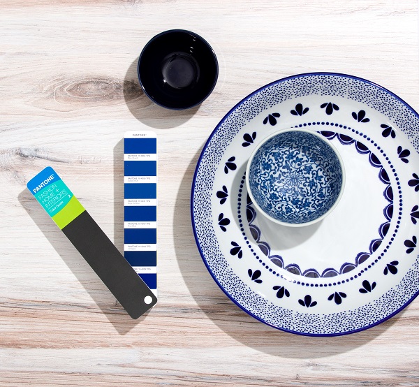
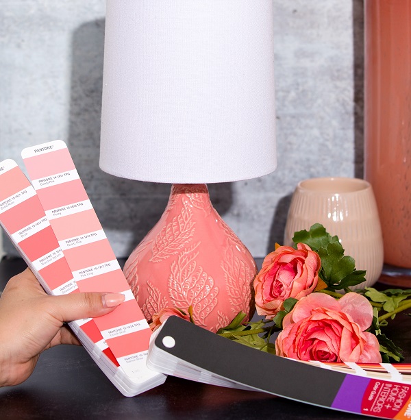
[Images courtesy of PANTONE]
Also check out these recent news


