
Indianapolis Colts Gets Scorned For Possibly Copying High School’s Logo Design
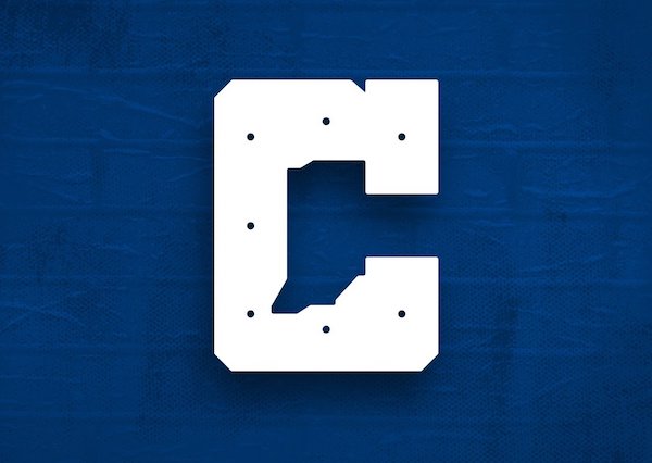
Image via Colts
The Indianapolis Colts switched up its visual identity, unveiling a new main logomark, color palette, and a ‘C’ monogram—which some think is a little Close for Comfort.
The secondary logo features the letter ‘C’ with its aperture shaped like the state of Indiana “to honor our home state and community,” the NFL team announced in a blog post. The symbol will complement the primary Horseshoe emblem and appear on the Colts uniform as well as the team’s merchandise.
Unfortunately, some believe they’ve seen this design before. Jere Kubuske, Vice Principal of local school Cathedral High School, said the Colts’ new logo seems to mimic something he designed back in 2016. The school’s version also depicts the letter ‘C’ with an image of the state carved out in the middle.
While Kubuske’s emblem for Cathedral High School doesn’t appear on the school’s website, it was in use on its Twitter account in 2017.
Addressing Twitter users who questioned if it was a Coincidence, Kubuske mentioned that the Colts had been frequently tagged in posts whenever the school used its facilities.
In response, the Colts’ VP of Communications Steve Campbell told Uni-Watch, “We have great respect for our friends at Cathedral, and we would never purposefully take an idea from them to use as our own,” stressing that this was “just not how the Colts do business.”
Campbell detailed that the logo was an “independent creation” from the NFL, and was not designed by the Colts or local creatives. “The Colts and the league were unaware of the other logo, and we wouldn’t have moved forward otherwise,” he reassured.
Campbell said the team will investigate the matter, and commended Kubuske for sharing the Colts’ values of “promoting athletics and paying tribute to our home state.”
Get 'em while they're hot. 📲 pic.twitter.com/jFz4AmW2iZ
— Indianapolis Colts (@Colts) April 13, 2020
The Colts logo being basically plagiarized from a high school is honestly a perfect opportunity for them to abandon it because it is TRASH, guys. It is SO bad. pic.twitter.com/sjRZ2NCVGx
— Sean | HopesAndMemes (@HopesAndMemes__) April 15, 2020
Good to know that even though I’m in WI now, I can still contribute to life in Indy. Thank you @Colts for ripping off my logo for @CathedralFBall pic.twitter.com/wavUWBfwVF
— Coach Kubuske (@CoachKubuske) April 13, 2020
Here is my original logo sheet and date of creation. pic.twitter.com/FZK1bIDvU8
— Coach Kubuske (@CoachKubuske) April 13, 2020
Here was @CathedralFBall ‘a first tweet in 2017... check the logo pic.twitter.com/dtWlSc02Ga
— Coach Kubuske (@CoachKubuske) April 13, 2020
More examples from 2017 pic.twitter.com/MddALcq1el
— Coach Kubuske (@CoachKubuske) April 13, 2020
[via Sporting News, cover image via Colts]
Also check out these recent news


