
Adobe Undergoes Major Brand Revamp, With Gradient CC, Redesigned Photoshop Logos
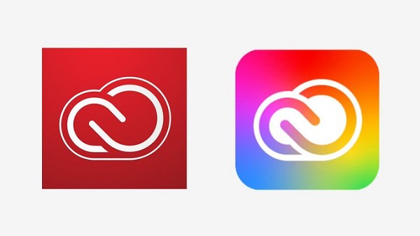
Left image: Old Creative Cloud icon | Right image: New Creative Cloud icon
Adobe has adopted a brand identity overhaul and unveiled a brand new icon for its Creative Cloud program.
The Creative Cloud logo, which previously boasted a red-and-white color scheme, now sports a striking gradient hue. According to the company, the gradient “brings the colors of Adobe’s product brands together.”
The new colorful scheme certainly is a joy to look at, as it offers a more artistic appearance, which would better appeal to a creative audience.
Adobe, too, has given its own logo a slight makeover, drenching it in a new coat of red. In its blog post, the company calls the new shade “warmer and more contemporary.”
Adobe has also updated the icons for its products, including Photoshop’s identity. The company decided to strip away the rounded borders, giving it a much flatter design. Other icons that were previously square have now been given rounded edges to keep them consistent. The changes were introduced “so that the system can flex to accommodate a range of operating systems and devices.”
Adobe will also introduce more colors to individual icons, such as the Video & Motion or Photography symbol, to ensure users can better identify its offerings.
Adobe Photoshop brand new icon.https://t.co/hpfmWcCNkq pic.twitter.com/VXOT79esTF
— Fabrizio Bianchi (@_fbrz) May 28, 2020
We’re constantly inspired by the stories you tell and the experiences you create with our products. To ensure everyone can easily find the products they need, we’re making some updates to our brand identity. https://t.co/D27tw9dqPI
— Adobe (@Adobe) May 28, 2020
[via Creative Bloq, opening image via Adobe]
Also check out these recent news


