
Christopher Nolan Redesigns ‘Tenet’ Movie Logo To Avoid Clash With Bicycle Brand

Old logo. Image via Warner Bros. Pictures
The simple and slick title logo of Christopher Nolan’s latest film, Tenet, has raised a few brows due to its familiarity.
Along with the release of its trailer, Tenet’s movie poster surfaced online, showing off its logo for the first time. Its last two letters are inverted, possibly referencing a time invasion, a central feature of the plot.
However, the logomark appears almost identical to the one used by a bicycle components company. After the trailer first dropped, Tenet Components clarified that it had not stolen Nolan’s design. Owner Tyler Deschaine also released a statement stating that his company had trademarked the “Tenet” name back in 2018.
Deschaine also reached out to Warner Bros. about the branding similarities, resulting in a response by Nolan himself. Nolan revealed that the film logo had taken him six years to design, and that it was “driven by a fascination with the symmetries of a word which was central to the story.”
Nolan obligingly added that he could take down the design since the bicycle company “went public” with the wordmark first.
Deschaine also requested that Nolan “use a different font or stylization,” so that there’s a distinction between the two. The updated logo, seen in the latest trailer, confirms that the last two letters are no longer inverted.
Warner Bros. will re-release Inception on July 17, the special anniversary theatrical event will also include new footage from #TENET and select upcoming Warner Bros. films pic.twitter.com/CgSyHpbGBD
— TENET News (@TenetUpdates) June 13, 2020
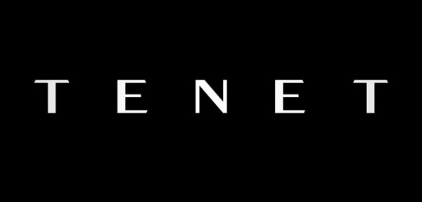
New logo
[via Creative Bloq, opening image via Warner Bros. Pictures]
Also check out these recent news


