
Goldman Sachs Adopts ‘Goldman Sans’ To Harmonize With Modern Finance World
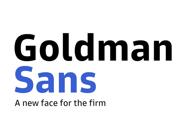
Image via Goldman Sans
Goldman Sachs now has its very own typeface to embody what its brand stands for.
‘Goldman Sans’ was designed as a “clear, contemporary and credible” typeface to accommodate the “needs of digital finance,” the company’s website explains. Goldman Sachs says it also incorporated its 150-year heritage into its vision foreseeing the company’s role in the future of the industry, as well as deliberated on a look that would be “approachable without being whimsical.”
Each letter contains open apertures for “clarity and accessibility,” and the letter like “i” gets a jutting at the top for “improved letter recognition.” The letters are also raised for legibility no matter the display size, while numbers are carefully differentiated to ensure no confusion with characters from the alphabet.
If you wish to use ‘Goldman Sans’, head over here to download the typeface.
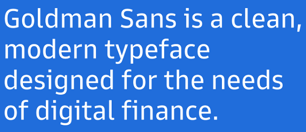
Image via Goldman Sachs
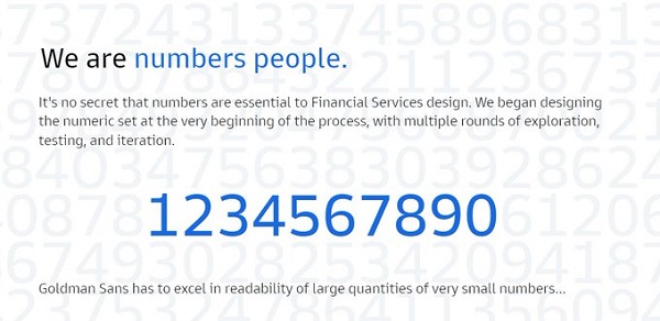
Image via Goldman Sachs
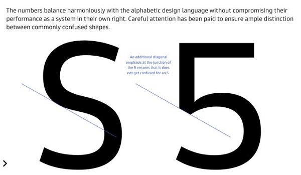
Image via Goldman Sachs
[via Boing Boing, opening image via Goldman Sans]
Also check out these recent news


