
TGI Fridays Reveals New Name & Logo, Customers Find It Difficult To Swallow
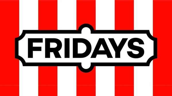
Image via Fridays UK
TGI Fridays in the UK is reopening its doors to customers once again under a new brand identity and logo.
The restaurant now goes by a spanking new name: Fridays. With a “simplified” menu, the brand decided to drop its catchy TGI prefix that rolled off the tongue since the restaurant opened its doors in 1965.
Now known as “Fridays,” the company has also unveiled its new logo on its official Twitter account.
The new wordmark sees the removal of the letters “TGI” and the word “Fridays” housed in a decorative black border. The mobile logo, on the other hand, has more character as the brand is plastered against a red-and-white striped background.
The word “Fridays” is spelled out with a plain sans serif font. The social media avatar features the letter “F” in a black condensed border. According to Brand New, the Fridays wordmark isn’t properly aligned inside the border, therefore it looks heavy on the left side.
According to the restaurant, the rebrand aims to bring back “that Fridays feeling” among consumers along with a brand new menu.
New logo, new menu, new look! You may notice a few more changes happening – stay tuned to find out what else is coming 👀
— Fridays UK (@TGIFridaysUK) June 23, 2020
Find out more: https://t.co/M7Zu0zECJh pic.twitter.com/xGNPRQZ7au
Noted: New Logo for TGI Fridays UK pic.twitter.com/6BH86KaFzZ
— Hudgens News (@Hudgenews) June 26, 2020
When try and fix something that isn’t broken... the Fridays I know and love is gone 😢 logo looks like something I could have made on Paint...
— Charlie Mills (@Charlie_James94) June 23, 2020
Is this a poor joke? Have I missed the punchline because there is zero incentive to visit again. 😭 Fridays at TGI will be no more.
— Emma Holmes (@EmmaSmileHolmes) June 23, 2020
Thanks i hate it
— samantha (@samttorrance) June 23, 2020
Listen lockdown has been tough for everyone, just go back to being TGI Fridays, put the old menu back and we’ll say no more on the matter okay? But also sack everyone who is making these moronic decisions, thanks 😂👍🏻
— Big Al (@Eval_Hell) June 23, 2020
[via Creative Bloq, opening image via Fridays UK]
Also check out these recent news


