
Unilever’s Logo Is Packed With All Sorts Of Details When You Take A Closer Look
Image via BalazsSebok / Shutterstock.com
Unilever, one of the world’s largest consumer goods giants with 400 brands under its domain, has a logo that evokes its vastness. It’s a little surprising that everyone recognizes the decorative symbol, but not many have felt intrigued enough to zoom into it.
The conglomerate’s ‘U’ monogram finally received the attention it deserved after it was broken down in a viral LinkedIn post shared by Ashikur Shourav, Assistant Manager of Digital & Media at Bangladesh-based digital agency MEDiABELL.
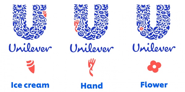
The graphic reveals that the Unilever logo design is made up of dozens of icons, each symbolizing a feature of Unilever’s business. When dissected, you’ll find that it’s stitched together with iconography of a dove, referring to brands like Clear and Axe; ice cream in reference to Cornetto and Magnum; lips as a symbol for Vaseline; and so on.
The company’s core values are also sewn in the fabric of the branding. There’s a bee icon representing commitment and community spirit, a DNA symbol for “heritage,” and a cluster of particles to mean science.
Unilever confirmed this on its website, detailing that a total of 25 icons can be found in the blue monogram to “represent something important to Unilever.”
“The icons that come together to shape the Unilever logo each signify something about our business… [and] Unilever’s core values, with each icon representing an aspect of the business.”
“From a lock of hair symbolizing our shampoo brands to a spoon, an ice cream, a jar, a tea leaf, a hand and much more, the little icons all have a meaning,” the global company revealed.
Images via
#TheBrandStory | The iconic @Unilever logo is actually an intelligent combination of 24 mini logos, denoting the products and services provided by them.#AgencyLife #DigitalMarketing #HUL #funfacts #hul pic.twitter.com/eR4ETKbQ82
— Laudco Media (@laudcomedia) July 16, 2020
[via Ashikur Shourav, cover image via BalazsSebok / Shutterstock.com]
Also check out these recent news


