
Designer’s TikTok Videos Expose Dark UX Patterns In Trump’s Campaign Website
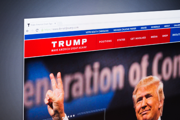
Image via Stefano Garau / Shutterstock.com
Websites often influence you into making decisions you’d never normally make. Don’t blame yourself too much; your online behavior is often puppeteered by a set of web design tricks called dark user experience (UX) patterns.
Dark UX patterns are probably why you occasionally miss the grayed-out box asking if you’d like to opt out of text alerts, or why you sometimes accidentally subscribe to newsletters.
While people would like to believe that any political decision they make is their own, what’s scary is that these sly tactics even slip their way into political initiatives. It turns out that they’re also lurking in President Donald Trump’s own campaign website, as one UX designer divulges.
In a couple of TikTok videos, UX/UI designer Mary Formanek dug into Trump’s site to uncover how visitors might have been influenced into topping up their donations towards his re-election campaign. Most compellingly, she noted that in the area for donations, the checkboxes indicating consent to contribute US$1,000 every month are selected by default.
She also said Trump’s site is intentionally a zone of “psychology overload,” so voters get the urgency to donate. The heavy use of red supposedly increases your heart rate, and a countdown clock triggers the compulsion to act fast.
It’s also confusing for the visually impaired. Elements in the website aren’t friendly for anyone who relies on a screen reader. Donation amount options, for example, are “broken up into different individual words,” she later told Salon in an interview. “It was like ‘$100,’ ‘plus,’ and then ‘$50;’ it wasn’t ‘$150,’” she said.
The site further capitalizes “You” and “Now” to further nudge supporters into taking action.
At the request of viewers, Formanek dissected the website of Democratic presidential candidate Joe Biden. To her surprise, even though she was expecting and looking for dark UX patterns in there, she couldn’t find any, though she gave a few tiny suggestions on how to eliminate possible confusion. The link back to the homepage, for instance, is the same font as his body copy, which may result in the call to action being ignored.
Her favorite website of 2020 election candidates so far turns out to be that of Alexandria Ocasio-Cortez’s—it’s not only user-friendly, but also actually friendly. The banner at the top is normally meant to be a call to action, but AOC’s team uses it to thank citizens for their support, instead.
Formanek shared in the interview that psychology is one of the main components of UX design because “we’re making systems for people,” so, “why people aren’t hitting the button that we thought would be super clear” is always a consideration.’
You can watch her series where she breaks down presidential campaign websites in the short clips below.
@uxwithmary #greenscreenvideo #darkux #userexperience #trump #dumptrump #scam #sneakintobasket #fyp #foryou #ui #uxdesigner #productdesigner #website #learnfromme
♬ original sound - uxwithmary
@uxwithmary #greenscreenvideo #part2 #darkux #ux #userexperience #dumptrump #trump #websitedesign #designer #learnfromme #uxdesigner #ux #badux #shady #foryou
♬ Classical Music - Classical Music
@uxwithmary #greenscreenvideo #biden #darkux #uxreview #biden2020 #userexperience #uxdesign #learnfromme #foryou #design #womeninstem #review #productdesigner
♬ FLUTE BOSSA - Stefan Dulov
@uxwithmary Reply to @troyreppas #greenscreenvideo #aoc #userexperience #darkux #uxreview #ux #ui #uxdesign #fyp #aocfanclub #website #politics #design #foryou
♬ The Best (feat. Leela James) (Instrumental) - Illect Recordings
@uxwithmary Part 2! ADA on websites 🤍 #userexperience #ux #uxreview #ui #uxdesign #fyp #foryou #aoc #darkux #aocfanclub #website #greenscreenvideo #aocstan #ada
♬ The Best (feat. Leela James) (Instrumental) - Illect Recordings
[via Salon, cover image via Stefano Garau / Shutterstock.com]
Also check out these recent news


