
Australia Scraps Its Heavily-Mocked New Logo For Emitting Coronavirus Vibes
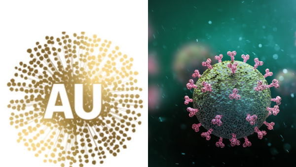
Images via Oatley MP Mark Coure and Shutterstock
Back in July, the Australian government unveiled its new national logo featuring the Golden Wattle—the country’s floral emblem that features a crown of long stamens, resembling a fluffy head.
With the announcement arriving in the midst of the COVID-19 pandemic, locals joked that the branding was too alike the microscopic appearance of coronavirus and lamented at the nation possibly being represented by the unfortunate image.
Australia’s National Brand Council had teased last December, before the coronavirus outbreak plagued the world, that the symbol was “an optimistic burst of gold positivity.” According to The Australian, this announcement has since been scrapped.
I can’t believe they have changed the Australian made logo to look like this, it looks like a virus. I will be writing to the Australia’s Nation Brand Advisory Council & Trade Minister @Birmo to reinstate the Kangaroo! pic.twitter.com/KzfMebQ9wR
— Mark Coure MP (@markcourelive) June 30, 2020
The untimely rebrand left a bad taste in people’s mouths and was even denounced by a number of Members of Parliament. Oatley MP Mark Coure remarked, “It looks like a virus,” while Queensland MP critiqued that “school students” would have done “a better job than this rubbish!”
The branding project had purportedly cost the government about A$10 million (US$7.24 million).
The Australian reported on Wednesday that the Federal Government has “quietly” withdrawn the heavily-ridiculed “wattle glow” emblem and is currently redesigning the logo.
It is, however, widely misunderstood that the wattle will replace the kangaroo in the Australian Made logo, which is stamped across products mostly manufactured or made from ingredients in Australia. In truth, it is meant to follow after the Australia Unlimited trade imagery of two orange boomerangs serving as a frame for a negative-illusion Australian map.
The redesign is expected to still feature the Golden Wattle, but in a way that doesn’t scream “coronavirus.”
[via The Australian, cover image via Oatley MP Mark Coure and Shutterstock]
Also check out these recent news


