
Intel Revamps Logo For Fear Of ‘Losing Relevancy,’ Now Sings More Than The Blues
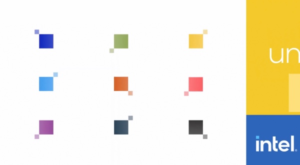
Image via Intel
Intel has accepted that it was losing its sheen, but it hasn’t let its spirit get dampened by the literal blues. The tech company has rebranded with a new minimalist visual identity to move on with the times.
The new wordmark is a combination of its only two other logos. The first, introduced in 1969, saw a letter ‘e’ dipping below the other letters, while the other, which debuted in 2006, featured the now-iconic Intel swirl.
In a bold move, Intel has dropped the ‘Intel Inside’ swirl. Meanwhile, the color blue remains baked into its personality, though it will make way for other vibrant hues because, as Chief Marketing Officer Karen Walker told Forbes in an interview, “We blue-wash[ed] everything.”

Image via Intel
A new version of the Intel “bong” sound will also be introduced later in the year. It will retain the same five notes but will be more “modernized.”
The company’s executives have been refreshingly forthright about the brand’s previous positioning. Walker said Intel saw the need for a transformation as it was seemingly “looking backwards versus forwards” and was “in fear of losing relevancy.”
John Coyne, Intel’s vice president of brand, described the classic Intel swirl as something that was “locked in an era” from “20 years ago.”
The new branding draws inspiration from Intel co-founder Robert Noyce’s quote, “Don’t be encumbered by history. Go off and do something wonderful.”
Aside from its familiar blue, Intel has adopted a lighter hue, as well as orange, black, and yellow for its revamped color palette. It will also adjust the color scheme to individual markets; for instance, more red will be used in Japan, where the hue holds extra significance.
Walker elaborated, “People freaked out just a little bit when we showed them the color palette because the company is so anchored in blue. But we blue-wash everything. It just loses its vibrancy.”
The rebrand was introduced alongside Intel’s 11th generation processor co-designed with partners like Acer, Dell, HP, and Samsung.
Walker said the stress Intel faced from forward-looking rivals was really a “good thing” as it forced the brand to “sharpen our edges.”
[via Forbes, video and cover image via Intel]
Also check out these recent news


