
Monotype Redesigns The Classic Futura For The Digital-Savvy 21st Century
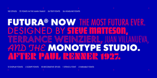
Image courtesy of Monotype
Futura, the retro-futuristic legend remembered as the only typeface to ever reach the moon, has been reinvented by type foundry Monotype to accommodate evolving 21st-century demands.
The classic typeface holds no bounds—having been used for fashion to publishing and manufacturing for more than 90 years, inspiring the creation of Verdana and many others, and even landing on the moon. The reboot, ‘Futura Now’, takes this versatility and ambition to extremes; the font family is more useful for people around the world, thanks to its 600 characters including 72 new family members, 102 styles, as well as support for 89 languages.
It also solves some nagging problems of Paul Renner’s iconic typeface that appear more amplified on digital screens. The classic Futura suffers a number of weight and spacing issues, and can often come across as “too heavy, too light, too loose, or too tight.”
Futura Now is designed to be digital-first to make the timeless typeface “modern” again with “a contemporary and rational alignment of names and weights for a better user experience,” the company describes in a press release.
The revamped typeface’s text and headline subfamilies offer “instant refinement” while revitalizing the original’s warmth, straightforwardness and clarity. Additionally, designers can make the most out of “the most Futura” geometric sans serif ever with new script, display, outlines, inlines, shadows, and stencil variants.
True to form, Futura Now is digital-centric with OpenType compatibility. It is also the first version of Futura to be available in a variable format. This means the beloved typeface’s weights, widths and optical sizes can now be exponentially experimented while driving down its digital footprint and loading times.
“Futura Now will inspire creatives to explore new uses for one of their favorite designs – perhaps one of the first typefaces they ever learned about,” said Steve Matteson, Monotype’s Creative Type Director. “This family demonstrates how even timeless designs can benefit from contemporary refinement without disrupting the nature of the original.”
Through 19 November 2020, two distinct weights—Futura Now Script Regular and Futura New Headline Bold—can be downloaded for free here.
The typeface is accessible in Monotype’s cloud-based font platform Mosaic, and can be licensed in single weights for US$49 or US$699 for the full family. Find out more about the font family via Monotype.
In related news, Monotype previously gave the famous Helvetica a makeover for the digital era.
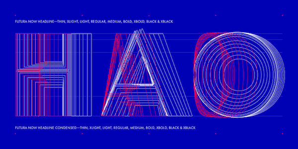
Image courtesy of Monotype
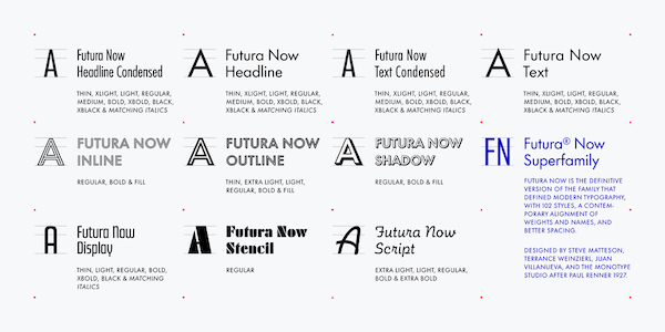
Image courtesy of Monotype
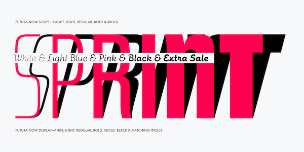
Image courtesy of Monotype
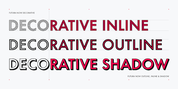
Image courtesy of Monotype
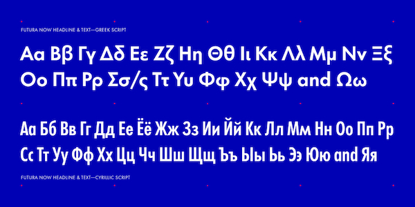
Image courtesy of Monotype
[via Monotype]
Also check out these recent news


