
Medium’s New Ellipsis-Inspired Logo Design Leaves People Scratching Their Heads
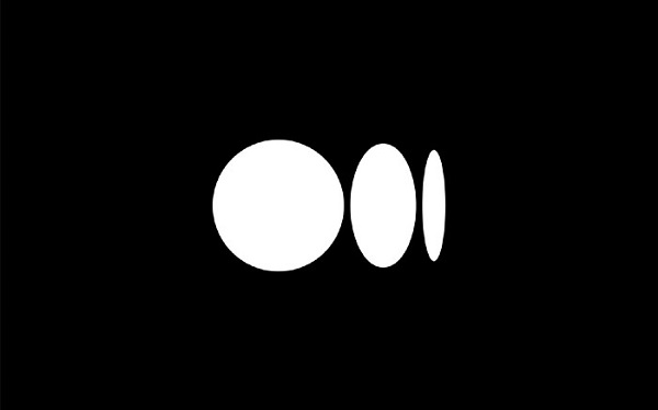
Image via Medium
Medium has unveiled a completely new logomark and icon, with the latter leaving many baffled.
The company teamed up with New York agency COLLINS for the rebrand. According to Medium, the new logotype only received subtle tweaks to make it look more polished.
The letterforms have been customized to make it feel more “inviting.” Meanwhile, the lines are “smoother,” the letters are “tighter” to improve readability, and the edges are now rounded to put emphasis on Medium’s literary roots. Overall, the wordmark stands “prouder” and gives off a classy yet contemporary look.
The more significant change was the icon created to embody the company’s language and typography. The logo is inspired by the ellipsis—a punctuation mark that represents an unfinished thought process or an idea to come—reflecting Medium’s core of always having “a new idea [and] always more to the story.”
Users, however, have had difficulty understanding the new logo design, and have presented their own theories on what the shapes represent. “In Medium’s new logo, ‘the distorted ellipsis,’ each circle represents a writer being squeezed by an ever-changing business model,” Casey Newton tweeted. One user even created a tutorial on how to recreate the symbol on Microsoft Paint.
Medium has been spicing up its look quite regularly in recent years. In 2015, it introduced its geometric ‘M’ monogram. Two years later, it was replaced by a flatter and more traditional letter. Finally, it has now introduced the aforementioned tweaks to shake up its identity.
Explained: The new Medium Logo:https://t.co/takIiBlH1L
— Rishi Raj Jain (@rishi_raj_jain_) October 14, 2020
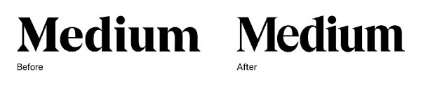
Image via Medium
Image via Medium
Image via Medium
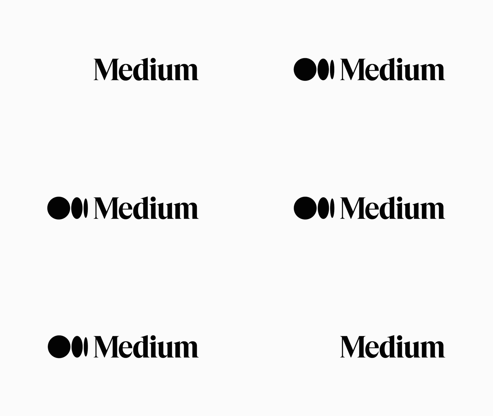
Image via Medium
Someone help me understand @Medium 's new logo?
— Rachel Gallucci (@rmgallucci) October 14, 2020
In Medium’s new logo, “the distorted ellipsis,” each circle represents a writer being squeezed by an ever-changing business model pic.twitter.com/uDzipz5rSv
— Casey Newton (@CaseyNewton) October 14, 2020
The new @Medium logo represents my rapidly diminishing sanity from the beginning of 2020 to now. pic.twitter.com/e1lHJQd1EJ
— Aimee Pearcy (@aimeepearcy_) October 14, 2020
How many more times will Medium rebrand...?
— Katarina Batina (@katarinabatina) October 14, 2020
[via Creative Bloq, cover image via Medium]
Also check out these recent news


