
Free eBook: Verdana Creator’s New Typeface Is Massive—200 Weights, 98 Languages
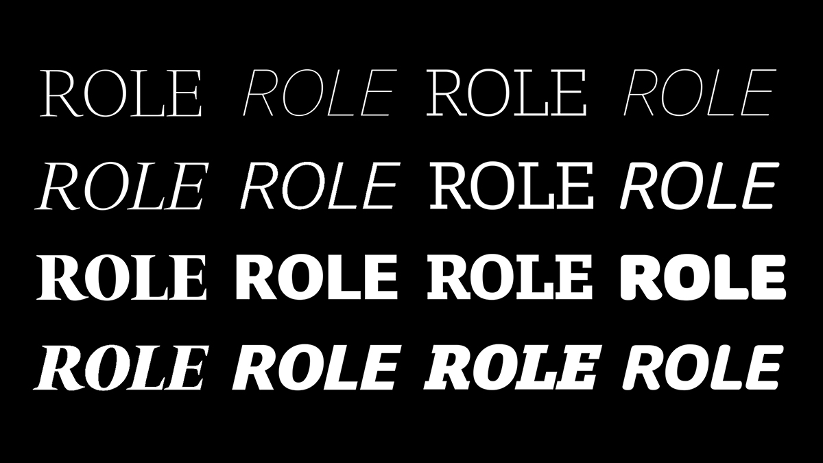
The Role superfamily is ultra-versatile, with 200 weights, three optical sizes, and support for a whopping 98 languages
You’ve probably seen his work every day for decades without realizing it. Matthew Carter is the design great behind big-league typefaces like Verdana, Georgia and Tahoma, earning himself the description of “the most widely-read man in the world” by the New Yorker.
His new typeface, Role, could be among his most ambitious undertakings yet. Designed alongside Japan’s premier type foundry Morisawa, Role speaks of the designer’s international reach—the Latin superfamily is ultra-versatile, with support for a whopping 98 languages and availability in 200 weights and three optical sizes.
Applying their combined experience with typography, Carter—with his 60 years of working with typographic techniques analog and digital—and the Japanese font foundry—with its near 100 years of studying the grace of Japanese design—have created a robust font superfamily covering serif, slab, sans, and soft styles for text, displays, and banners, with a script version in the works.
The relationship between Morisawa and Matthew goes way back. The designer was a judge at its typeface design competition in 1993, and in 2014, he was commissioned to design Morisawa’s first Latin typeface. This is it.
The multifaceted font family is now available to license on Fontelier.
The possibilities of this single typeface are boundless, so Morisawa teamed up with Carter’s former students, Alicia Cheng and Sarah Gephart from MGMT Design in Brooklyn, to create a specimen booklet showcasing Role Family’s myriad personas and applications.
You can request for the free eBook here.
Ultra-Versatile: 98 Languages, 200 Weights
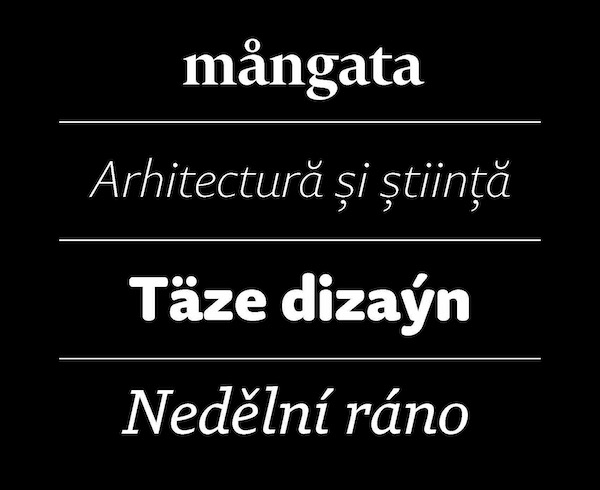
Role is available in 98 languages
As its name suggests, Role is a one-type show that can take on many hats. Its compatibility with 98 languages ensures seamless adaption for brands with global and multilingual presence.
Role also offers astonishing mileage out of a single typeface. The superfamily is built with sans, serif, soft, and slab looks with 200 weights and three optical sizes, allowing you to create countless looks out of one font family. On top of that, there’s a fifth style, Role Script, on the way.
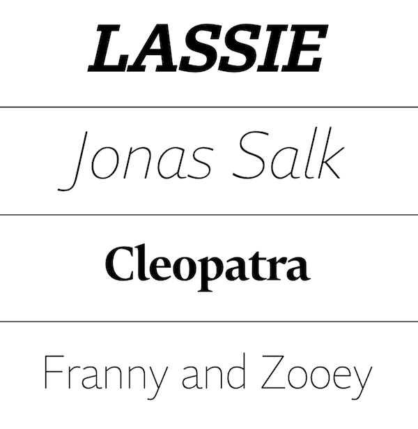
From top to bottom: Role Slab Banner, Role Sans Banner, Role Serif Banner, Role Soft Banner
Going deeper, Role defies the one-look-fits-all trope of versatile typography. Rather than simply scaling up or down, you’ll find unconventional tweaks between text, display, and banner variants. For instance, Role Serif Display and Banner take the elegance of Role Serif Text up a notch with upright italics. Role insists that consistency and sameness don’t have to go hand-in-hand.
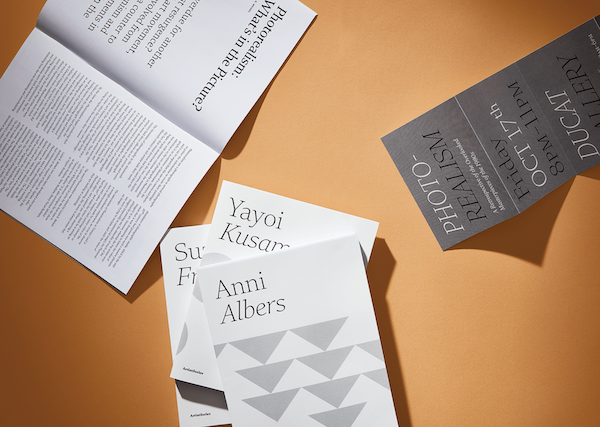
Role Serif
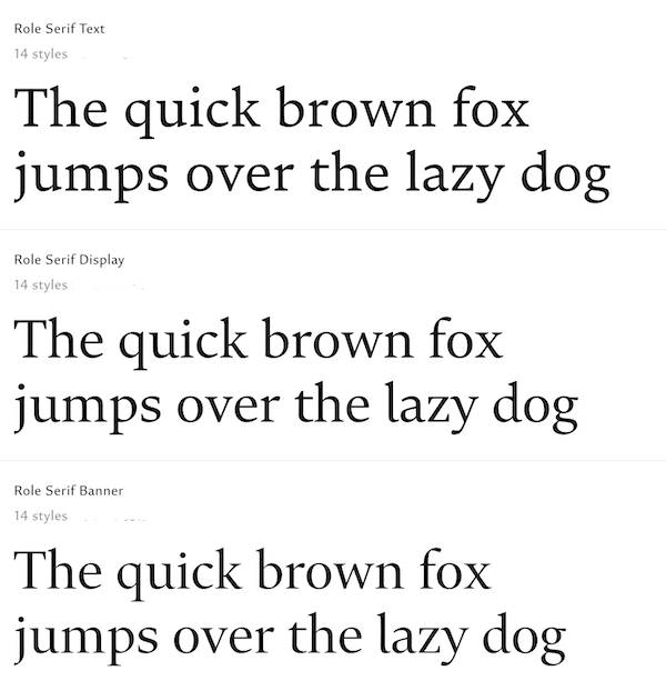
Role Serif
You may already be familiar with sans, serif, slab, and script styles, but what’s less commonplace in Latin font families is the rounded sans look. Enter Role Soft, which offers a whole exciting tier of options to make your projects look warm, inviting, and informative.
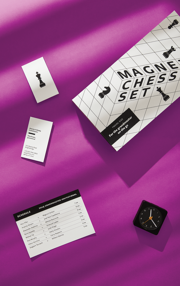
Role Soft
Succeeds beauty standards across cultures
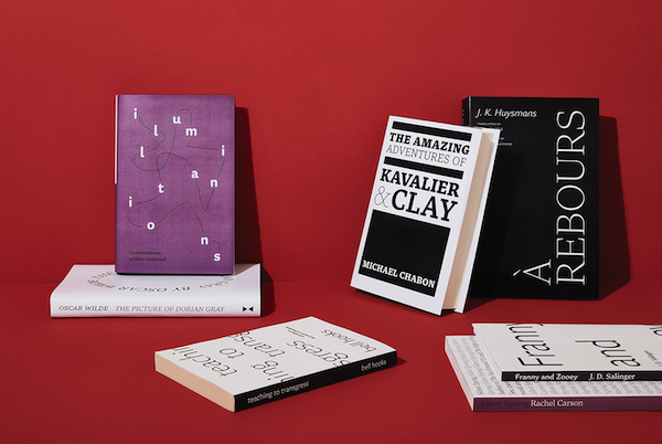
Role and its various display settings
Role is a cross-cultural, multi-year project that began in 2015. Carter started on the preliminary letterforms for Role, before three Japanese designers—Morisawa’s Sakura Taruno and Shotaro Nakano, as well as Shotype Design’s Kunihiko Okano—moved to Cambridge and spent six months on the project with him. Two additional Morisawa designers, Yuya Kobari and Ai Handa, later joined the team.
What Carter imparted in Latin typography expertise, the designers returned with the Japanese understanding of delicacy and weight in strokes.
Which is why Role, no matter which style of it you use, has a grace that’s hard to find in many “multipurpose” Latin typefaces, where certain strokes can often look too heavy. In Kanji typography, an artform Morisawa has mastered for nearly a century, spacing is not so much about kerning than it is about the placements between strokes of a character. Adapted to Role, this lends a legibility to Latin fonts like no other.
How to use Role: From websites to brand stationery & greeting cards
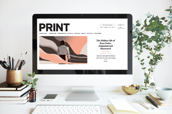
Role is the official typeface for Print Magazine
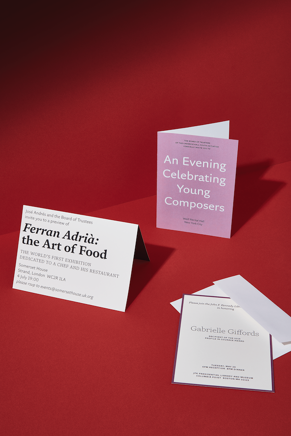
The Role Family on invitation cards
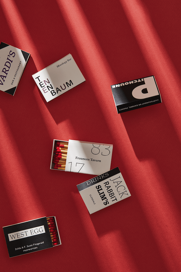
Role, printed on business cards and matchboxes
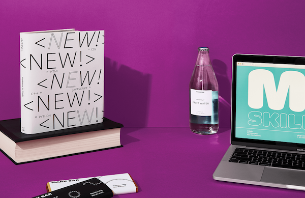
Role Soft
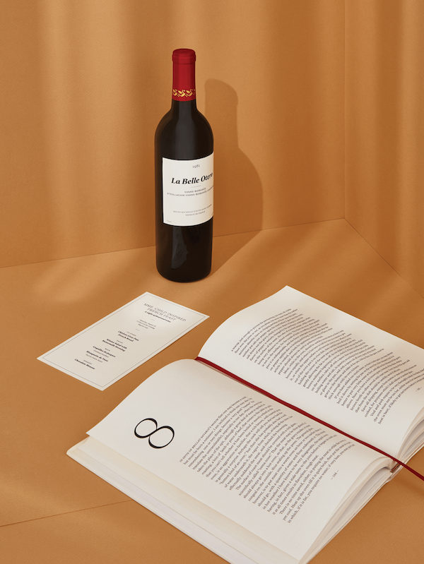
Role Serif
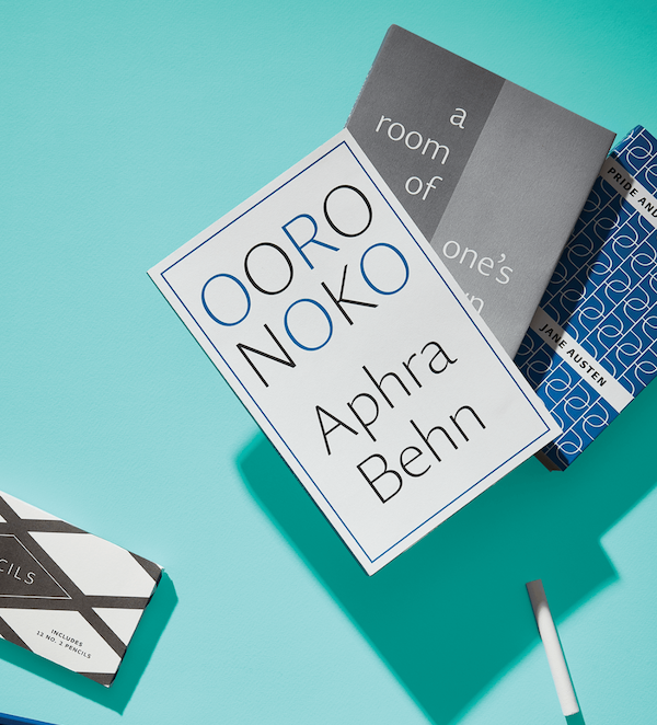
Role Sans
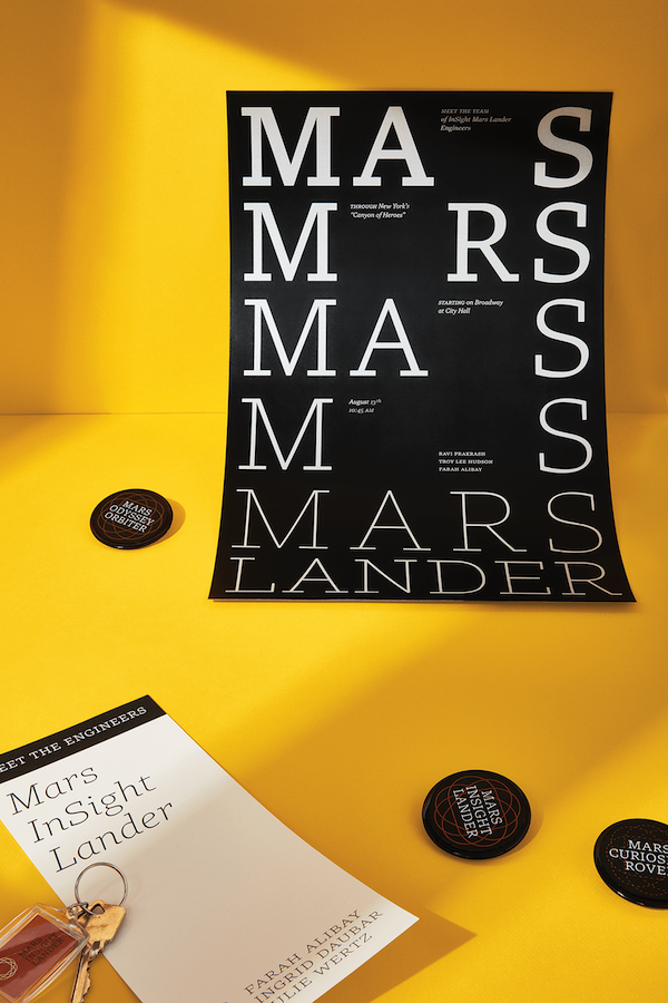
Role Slab
Of course, the capabilities of the Role superfamily stretch beyond these examples.
For more ideas, request for a free eBook provided by Morisawa. You can also find out more about Role here.
This is a sponsored post.
Also check out these recent news


