
Opel Reveals New Logo & Striking Brand Identity To Match Its Electric Ambitions
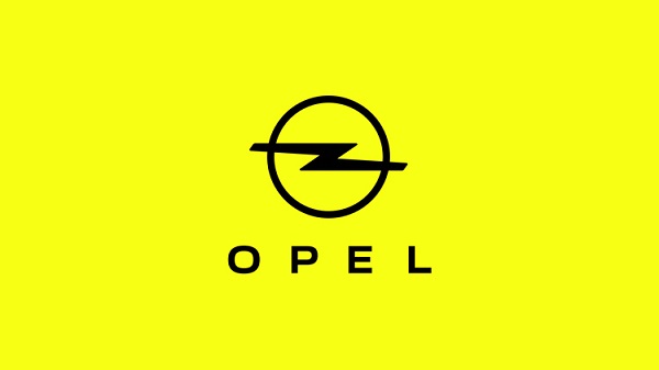
Image via Opel
German car brand Opel has presented a new brand identity to cater to the younger audience.
The new look is characterized by finer lines, a striking neon background and a new typeface.
The new logo is similar to the previous one, except that it is “more finely drawn” and it signals “the brand’s innovative strength.” It has a slimmer ring and is accompanied with a bright yellow background to match its electric ambitions. The brand’s name is printed in the new Opel Next typeface and the lightning bolt is now thinner in appearance. All the new looks combined represent a “modern and courageous” appearance.
“We are confident, young-minded and inclusive. In this new era, Opel is taking inspiration from progressive, ‘cold to cool’ Modern German culture and re-emerges bold, pure and contemporary,” Xavier Duchemin, director of sales and marketing at Opel, says of the new identity.
Opel hopes that the new Blitz logo together with the new color and design language will create an “unmistakable identity” of the brand in the automotive industry.
The previous logo has been replaced by this flat design, which will roll out across car models in spring 2021 including the Opel Crossland and Mokka. The new look will also be used across all platforms and products.
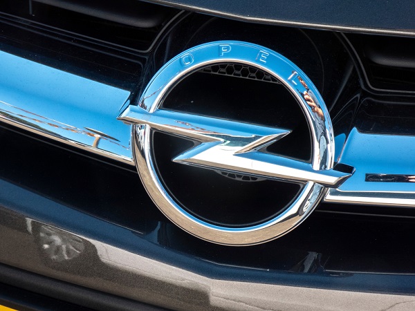
Old logo. Image via Cineberg / Shutterstock.com
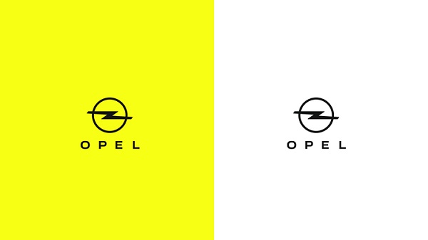
Image via Opel
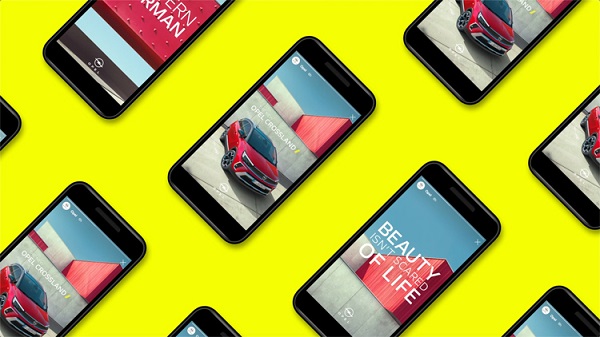
Image via Opel
[via Motor 1, cover image via Opel]
Also check out these recent news


