
CIA Reveals Dynamic Website & Logo In Hopes Of Diversifying Its Recruitment Base
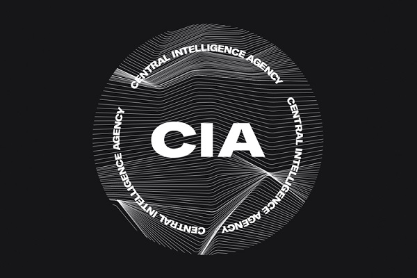
Image via CIA
The CIA has launched a rebranding effort in an attempt to attract a diverse talent pool to its organization. With the hashtag ‘#DiscoverCIA’, it has debuted a new website and logo design on Twitter.
The new website involves a black and white identity with red accents and a range of typefaces, including Grilli Type’s GT America. The website also introduces more photos of women and people of color, as well as a new logo.
The new emblem has a monochromatic theme and features the CIA acronym on a background filled with fractal lines.
The CIA’s director Gina Haspel hopes that the overhauled website will give off a sense of “dynamic environment that awaits them here.”
The new branding has prompted numerous responses on Twitter. One user has pointed out that the new look resembles posters from Canadian electronic music festival Mutek, while another user has likened it to online music broadcasting platform Boiler Room.
The design community has also weighed in on the rebrand, with illustrator Sarah Squirm claiming it looks like something for “a modular synthesizer festival in Berlin,” while RGA’s creative director Zach Roif describes that it looks like a “hungry independent ad agency focused on their culture as much as their work.”
Designer David Rudnick claims that “with this rebrand, the CIA has lost all credibility,” while Michael Beirut believes it is reminiscent of the graphic design for the TV series Homeland.
Despite the mixed responses, CIA spokesperson Nicole de Haay says its latest recruitment drives are showing results. “Our incoming class is the third-largest in a decade and represents the most diverse talent pool, including persons with disabilities, since 2010,” she reveals.

Old logo. Image via Shutterstock
— CIA (@CIA) January 5, 2021
New opportunities are approaching. #DiscoverCIA pic.twitter.com/C5QWxXzI2Q
— CIA (@CIA) January 2, 2021
Rejected redesign for the CIA pic.twitter.com/PGULcfzb9B
— ᖇYᗩᑎ (@bjorlax_) January 4, 2021
The CIA is recruiting tumblr girls pic.twitter.com/MjYc1SGckN
— Devin (@dev_nieus) January 4, 2021
CIA about to release the most minimal tech dnb EP of 2021 pic.twitter.com/m7866w6Jpp
— IMANU (@imanumusic) January 4, 2021
CIA rebranding as a modular synthesizer festival in Berlin pic.twitter.com/3PQwejMGUq
— SARAH SQUIRM (@SarahSquirm) January 4, 2021
The CIA used to have fantastic graphic design pic.twitter.com/OjahZQwQHq
— Michael Bierut (@michaelbierut) January 5, 2021
for me, with this rebrand, the CIA has lost all credibility
— ཊལབསརངཧ (@David_Rudnick) January 4, 2021
The new CIA logo is literally a Mutek poster pic.twitter.com/3RsPzWzDFt
— snacks pearl (@maxpearl) January 4, 2021
Can't wait for the CIA Boiler Room set https://t.co/QlHBXbHxDa
— Dani Deahl (@danideahl) January 4, 2021
[via It’s Nice That, cover image via CIA]
Also check out these recent news


