
Burger King Shares The Early Artworks That Led To Its Delicious Rebrand
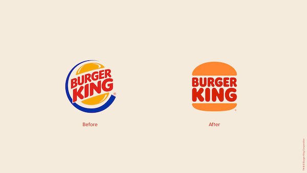
Image via Burger King / Business Wire
Burger King has left design critics and customers around the world satiated and full with its massive brand identity revamp, something that’s rarely achieved.
The redesign spotlights a logo similar to Burger King’s beloved cartoon branding from 1969. The symbol features a flat ‘Burger King’ wordmark sandwiched between two buns, but also takes after the neater typeface used in the 1994 rendition.
Fans are particularly fascinated by the distilled version of the logo, which shows the letter ‘B’ stylized as burger buns, with the ‘K’ representing a patty. This icon is especially effective, now that Burger King and its creative agency Jones Knowles Ritchie have adopted a more authentic color scheme that resembles its fresh ingredients and flame-grilling method.
OH MY GOD. pic.twitter.com/soeDF4WGGW
— Jeeves 🇪🇺🇲🇽🏳️🌈 (@jeeveswilliams) January 7, 2021
Burger King noted that the new visual identity illustrates its “real, simple and delicious” food, and symbolizes its approach towards using natural produce instead of artificial additives.
While many would just be happy with the end results of the overhaul, it’d also be interesting to know what went on behind the scenes. Thankfully, the designers tasked to work on the redesign have come forth to satisfy your appetite for the new Burger King branding.
The team have unveiled the first iterations—some 80 variations—that led to the finalized versions. These included slab treatments of the Burger King wordmark and monochromatic icons of a crown between buns.
“As a designer I’ve been always curious about looking into behind the scenes and the process before the final polished design outcome,” explained Rapha Abreu, Burger King’s Glopbal Head of Design. “Editing and choosing what will be left behind is probably the hardest on a big rebrand like this.”
Fernando Machado, Global Chief Marketing Officer of Burger King and Popeyes parent company RBI, also unveiled the first mood board the agency had sent the brand which helped inspire the retro yet contemporary look.
“There were many others,” Machado acknowledged. “But this [mood board] was love at first sight. It felt right for the brand. Modern and classic at the same time (I know... sounds contradictory... but it isn’t).”
It looks like the designers had a clear idea about what the brand’s voice would be like from the start. Not much flaming involved, it seems.
The sketches:
As a designer I’ve been always curious about looking into behind the scenes and the process before the final polished design outcome. Editing and choosing what will be left behind is probably the hardest on a big rebrand like this. Here is our first new logo explore #BurgerKing pic.twitter.com/TkhUkkW03R
— Rapha Abreu (@raphabreu) January 8, 2021
The final version:
The first mood board:
This was the first mood board @jkrGlobal presented for the new #BurgerKing visual identity. There were many others. But this one was love at first sight. It felt right for the brand. Modern and classic at the same time (I know... sounds contradictory... but it isn’t). #design pic.twitter.com/GKxho2f8yf
— Fer Machado (@fer_machado123) January 9, 2021
The final look:
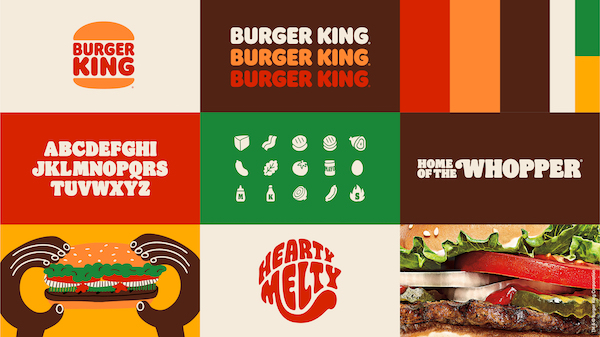
Image via Burger King / Business Wire
Truly excited with the #BurgerKing visual identity work we are unveiling today. It was about time! Thanks @jkrGlobal and our talented design team for the incredible work. #marketing #design pic.twitter.com/fX9EI0bXzK
— Fer Machado (@fer_machado123) January 7, 2021
The sketches:
Design work takes time. It evolves. I guess we ended up picking the right one. This is one page out of an endless amount of pages with different versions and possibilities. And the final one is not even here. #design pic.twitter.com/eC4WHnaSuF
— Fer Machado (@fer_machado123) January 8, 2021
The final version:
Blue/Gold dress but for burgers: pic.twitter.com/TM7XdDELJ2
— Jones Knowles Ritchie (@jkrGlobal) January 8, 2021
[via Rapha Abreu, images via various sources]


