
Post-It Quietly Rolls Out Updated Logo Featuring Cleanly Designed Sticky Notes
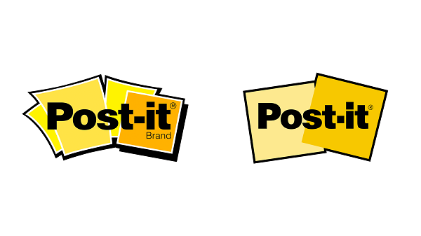
Left: Old logo Right: New logo. Image via Post-It
Post-It has quietly revealed an updated look on its logo.
The new logo features a cleaner design of its famous sticky papers. This replaces its previous four curve-edged Post-It notes, and creates a simple, perfectly-squared design.
The flatter design appears behind the brand’s name, which has also received a subtle change. While the sans-serif typeface has been retained, the hyphen and dot above the letter “i” have been tweaked to be shaped into squares.
The new design has received mixed reviews from the internet. While many have applauded the brand for its “simplified, streamlined and modernized” symbol, others claim to be tired of this trend.
“To me it looks cleaned-up, simplified, streamlined and modernized. It respects the brand heritage while removing clutter. It’s so simple you could draw it in the sand,” a Twitter user said. Another user tweeted, “I dig the simplification.”
One Twitter user, however, claimed the new version “looks boring.”
Check out Post-It’s minimal wordmark below.
To me it looks cleaned-up, simplified, streamlined, and modernized. It respects the brand heritage while removing clutter. It’s so simple you could draw it in the sand—one test of a good mark, IMO.
— zeldman (@zeldman) January 23, 2021
Looks boring 😴
— Johnny Logo 🏴 (@Johnny_Logo) January 23, 2021
I Like-It, it's much cleaner compared to the old logo.
— Chris R (@Chrs_re) January 22, 2021
I dig the simplification
— Isaiah Headen 💯 (@isaiahheaden) January 22, 2021
[via Creative Bloq, cover image via Post-It]
Also check out these recent news


