
In 1773, A Designer Transformed The Alphabet Into Architectural Floor Plans
Images via Internet Archive (public domain)
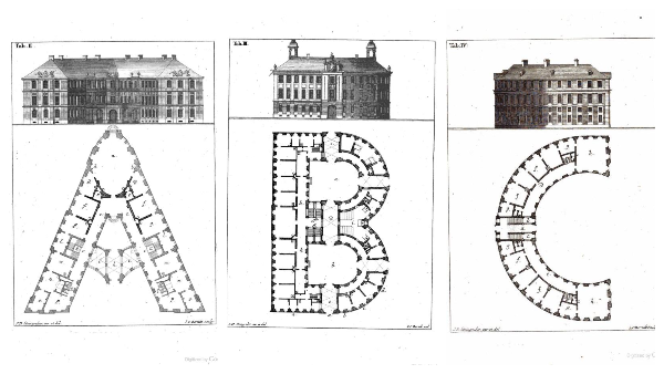
An 18th-century German architect was well ahead of his time with the fascination about typography. In 1773, Johann David Steingruber, who was involved in the construction of over 100 buildings, published an entire book depicting the alphabet as majestic architecture.
The book, Architectural Alphabet, featured illustrations by Steingruber that imagined the shapes of letters as floor plans of baroque palaces, per ArchDaily.
Baroque architecture typically included oval antichambers, vaults and domes.
The book’s pages have left the creative community in awe once again after being shared by stationery store Present & Correct on Twitter.
This seems to be the sort of project designers of today would pour their hearts into. Likewise, it was a “labor of love” for the architect rather than something for work.
Preview some examples of letters as buildings, and browse the full book here.
In 1773 Johann David Steingruber created a complete alphabet of mythical letter shaped buildings & their floorplans.
— Present & Correct (@presentcorrect) January 25, 2021
Full book: https://t.co/E9uXlT3aHU pic.twitter.com/xvrKUHf2Ko
— Victoria Vu (@paperandtype) January 25, 2021
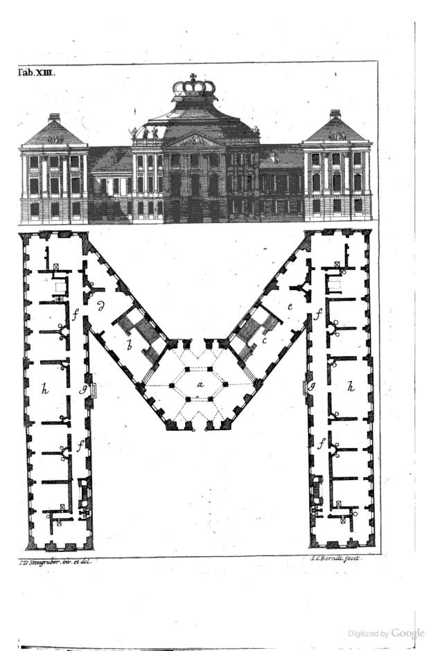
Image via Internet Archive (public domain)
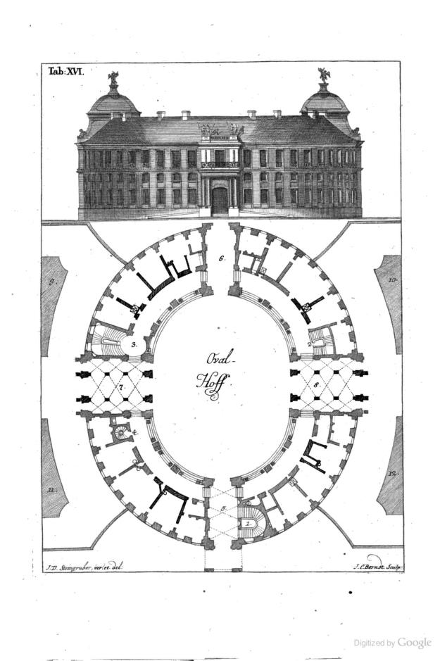
Image via Internet Archive (public domain)
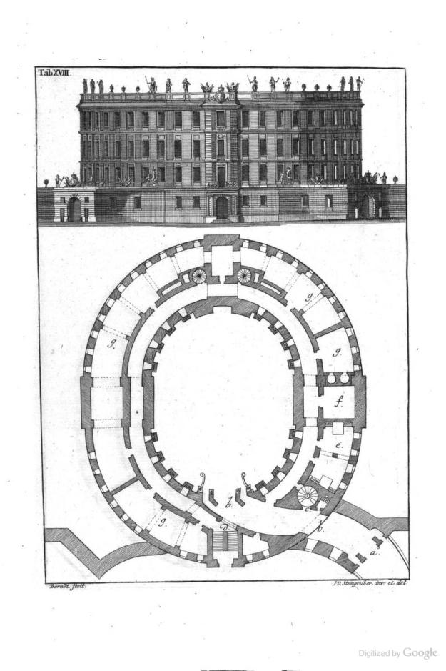
Image via Internet Archive (public domain)
[via Kottke, images via Internet Archive (public domain)]
Also check out these recent news


