
Nintendo’s Scrapped Wii Logos Surface After 14 Years—And What A Range Of Styles!
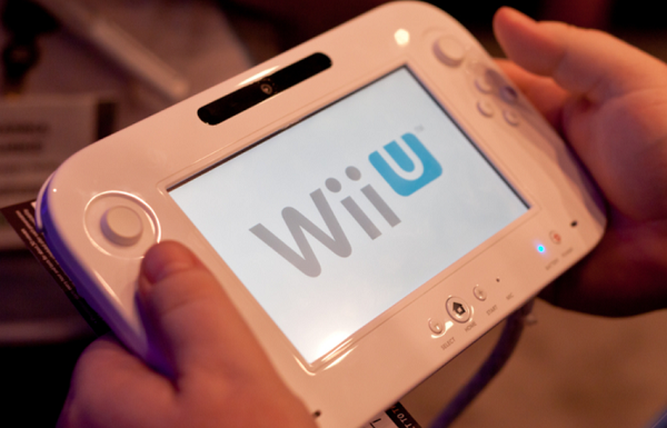
Image via Barone Firenze / Shutterstock.com
A 2007 company handbook from Nintendo Co. has surfaced online and it showed dozens of unused logo designs for the Nintendo Wii console.
The logo designs have been shared in a tweet by Nintendo Memories, and it showed the different approaches the company was looking to promote the system. Some of the concept sketches visualized people holding hands, multiple tittles featured above the letter ‘i,’ as well as slanted typographic variations.
The designs have generated a buzz online, with many users weighing on their favorite designs.
Take a look at the unused logos below. Whether or not the Wii would have much success with these alternative designs is hard to say, but it gives you an interesting insight into what could have been.
Nintendo #Wii tentative logos from the NCL 2007 Company Book.
— Nintendo Memories (@NintendoMemo) January 27, 2021
"Wii beginning new era" 🙃
Nintendo Weiird 🤔 pic.twitter.com/uKGqC31DAM
Thanks for sharing! This one is my favorite pic.twitter.com/oFbkbqexNo
— Fez (@TheMysticFez) January 27, 2021
this one is awesome, it looks like a wiimote being swung around and it even has the player number dots pic.twitter.com/nj4oWkawPy
— V🐰xy 🏳🌈 / ✊🏾✊🏽✊🏿 (@voxybuns) January 28, 2021
some personal highlights for me include:
— mylesOS (@combotent) January 28, 2021
1) "who hired the guy who designed the sony vaio logo"
2) "hey apple can i copy your homework?"
3) wrr. ~wrr.~
4) "let's lean into the whole 'channel' thing" pic.twitter.com/9v4G4SXqPo
This one's cute. They're holding hands ❤️ pic.twitter.com/dGRu9G7lRH
— ♡ Wyvern ♡ (@wyvern_tail) January 28, 2021
[via Creative Bloq, cover image via Barone Firenze / Shutterstock.com]
Also check out these recent news


