
This Brilliant, Shape-Shifting Logo Embraces The Idea Of Differences

Image via Studio Sutherl&
London-based creative agency Studio Sutherl& has created a new visual identity for social change organization Perspectiva that involves shape-shifting typography.
The idea is to unite and diverge different viewpoints, and the studio channeled this concept into a range of logotypes that unravel in various directions across an isometric grid.
The mesmerizing visuals aim to capture the “literal idea of a multi-perspective,” the studio explained. The team also worked on the book cover designs of the organization’s publishing arm, and it features headlines that wrap around the spine from the back to the front cover of the books.
Its webpage also boasts similar imagery, with words that twist further when you hover them. This concept puts forth different ways of looking at the world through education, events, and publication, which the charity is passionate about.
“Our charitable purpose is to develop an applied philosophy of education for individual and collective realization in the service of averting societal collapse,” the Perspectiva website states.
Studio Sutherl&’s Jim Sutherland told Creative Bloq that the charity’s broad range of views and content had posed some challenges for the project.
This reflected the studio’s approach, as the debates are “not simple but multifaceted and multi-layered,” Sutherland added. It needed an identity to reflect that and decided to use typography to embody these concepts.
“We were therefore trying to typographically articulate the complex notions of multiple perspectives on multiple issues,” he explained.
The studio did a great job of creating an identity that embodies multiple perspectives. It incorporated a bespoke “perspectival typeface,” which involves designing each letter in three different versions, allowing it to unfold into an isometric grid. The typeface is minimal and complex, while being serious and fun at the same time.
Our new multi-faceted identity for Perspectiva - a philosophical collective for social change @Perspecteeva pic.twitter.com/csEqjXfUJ8
— Studio Sutherl& (@andSutherland) February 2, 2021

Image via Studio Sutherl&

Image via Studio Sutherl&

Image via Studio Sutherl&
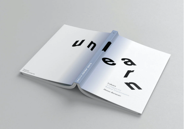
Image via Studio Sutherl&

Image via Studio Sutherl&
[via Creative Bloq, cover image via Studio Sutherl&]
Also check out these recent news


