
McDonald’s Reveals Global Packaging Redesign That’s Playful Yet Functional
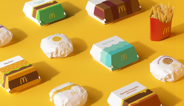
Image via Pearlfisher
McDonald’s has partnered with independent creative agency Pearlfisher for a global packaging rebrand that offers a modern expression of the fast-food chain.
The playful graphic system aims to bring joy and ease. With over 60 million touchpoints being used every day, packaging matters, and Pearlfisher decided to opt for a prominent on-pack messaging in the new branding.
The famous menu items are now housed in new boxes, sleeves, wrappers as well as cups. Egg McMuffin wrappers look whimsical with a yellow yolk plastered in the middle of an all-white wrapper. The graphics of the Quarter Pounder and Big Mac boxes mimic the signature burgers, while the Fillet-O-Fish box features two-toned ocean waves.
The red French fry sleeve, on the other hand, has only received subtle modifications, with its inner pinstripes being replaced by thick yellow stripes.
The aesthetically-pleasing new look allows the packaging to be functional yet joyful at the same time. The graphical representations of the iconic menu items also make each of the items appear “more connected and evocative of McDonald’s playful point-of-view.” No matter the combination of each order, the packaging serves as an expressive visual system.
The new packaging will also help boost efficiency during operations. Each wrapper and pack is identifiable where order assembly occurs. “These easy-to-understand graphics drive recognition regardless of where in the world orders are being assembled, shared, and enjoyed,” said Matt Sia, creative director at Pearlfisher. “Our task was finding out what was special about each menu item to design a system that would make it easy for others to do the same.”
“There’s beauty in the simplicity of McDonald’s iconic menu items. We aimed to find the most special, recognizable, and iconic expressions of each—celebrating them in a way that makes people smile,” Sia continued.
“Pearlfisher helped to ensure that this redesign modernizes our brand, highlights the specialness of our menu, and delivers on our commitment to quality,” McDonald’s senior director of global menu strategy Barbara Yehling said.
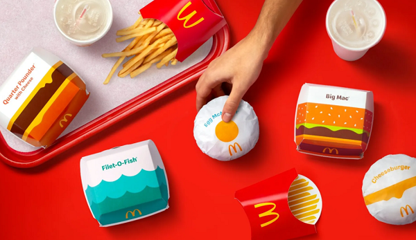
Image via Pearlfisher
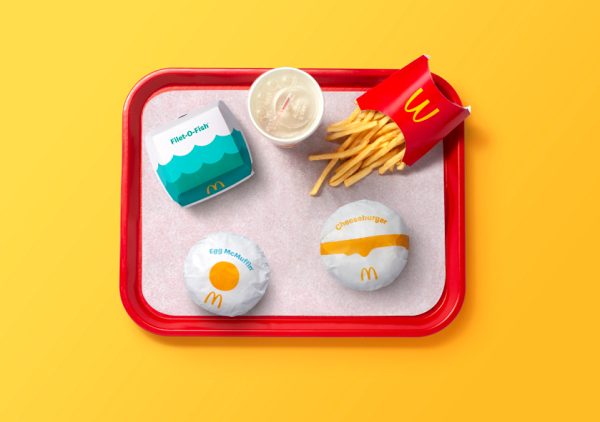
Image via Pearlfisher
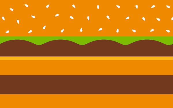
Image via Pearlfisher

Image via Pearlfisher

Image via Pearlfisher
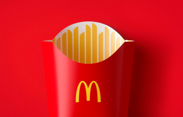
Image via Pearlfisher
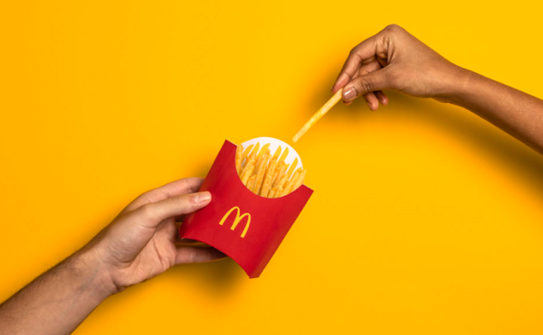
Image via Pearlfisher
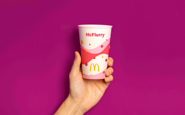
Image via Pearlfisher
[via It’s Nice That, cover image via Pearlfisher]
Also check out these recent news


