
Peugeot’s Lion Ferociously Takes Command In Roaring New Brand Redesign
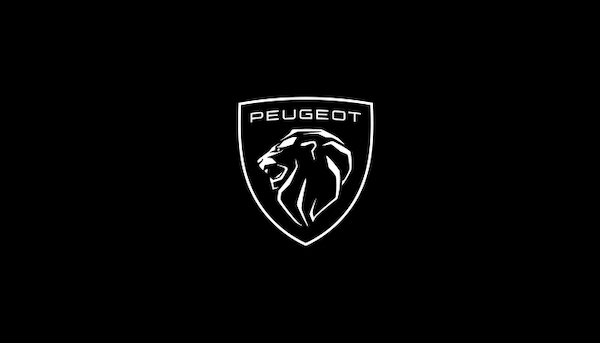
Image via Automobiles Peugeot
Having merged with Fiat Chrysler to become Stellantis so as to go head to head with electric vehicle tastemakers, Peugeot has given its branding a powerful makeover; hear it roar.
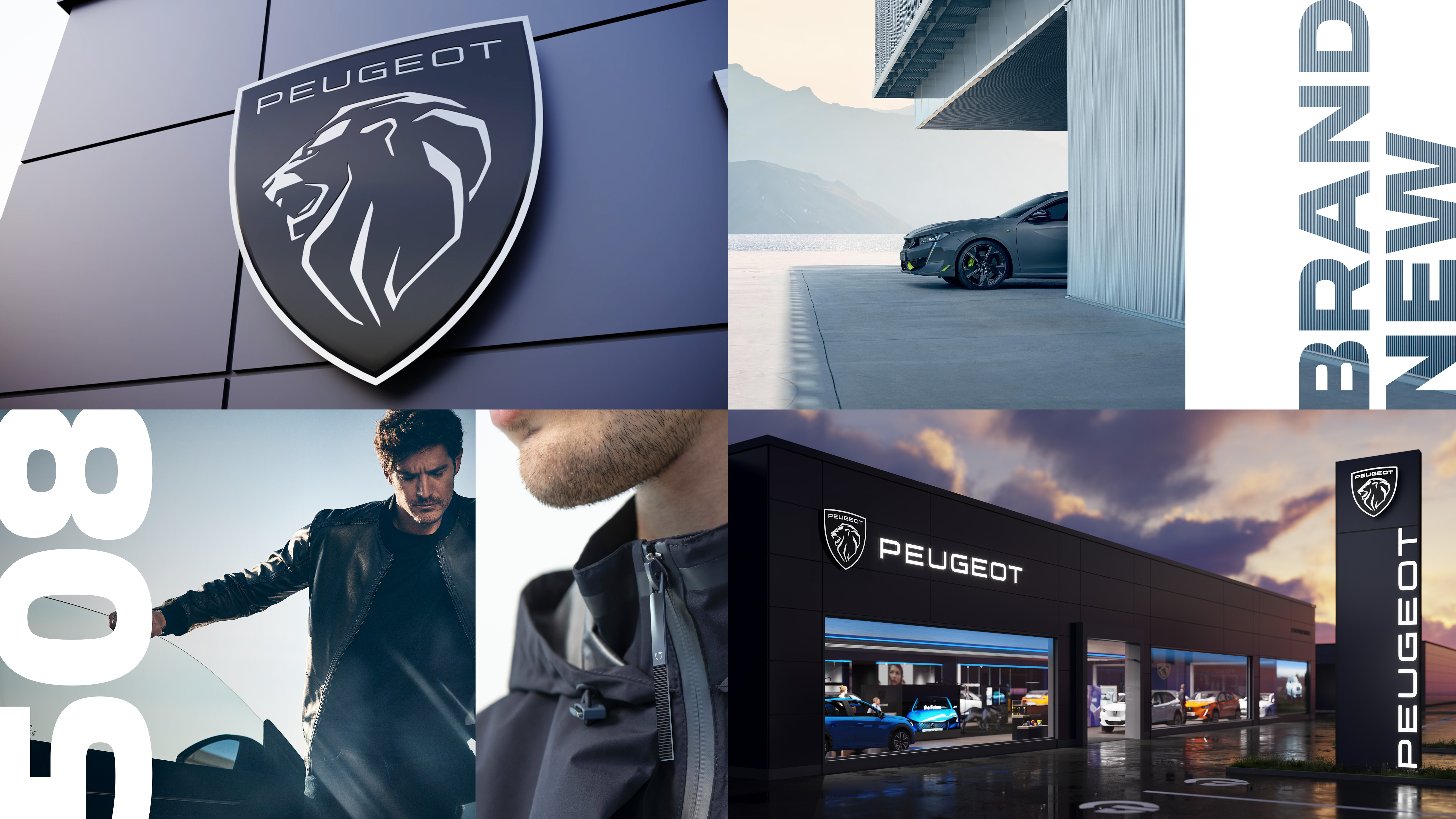
The facelift marks Peugeot’s 11th logo and the greatest branding update since 2010. Straightaway, you’ll notice that the new coat of arms only displays the lion’s head, but that doesn’t mean the branding doesn’t have legs to take it far. The majestic creature has a visible, larger-than-life mane, and it opens its mouth to unleash some formidable fangs.
As the oldest-surviving automaker, Peugeot endeavors to reaffirm its character and heritage in the new brand identity while keeping pace with its vision to take on the electric vehicle business.
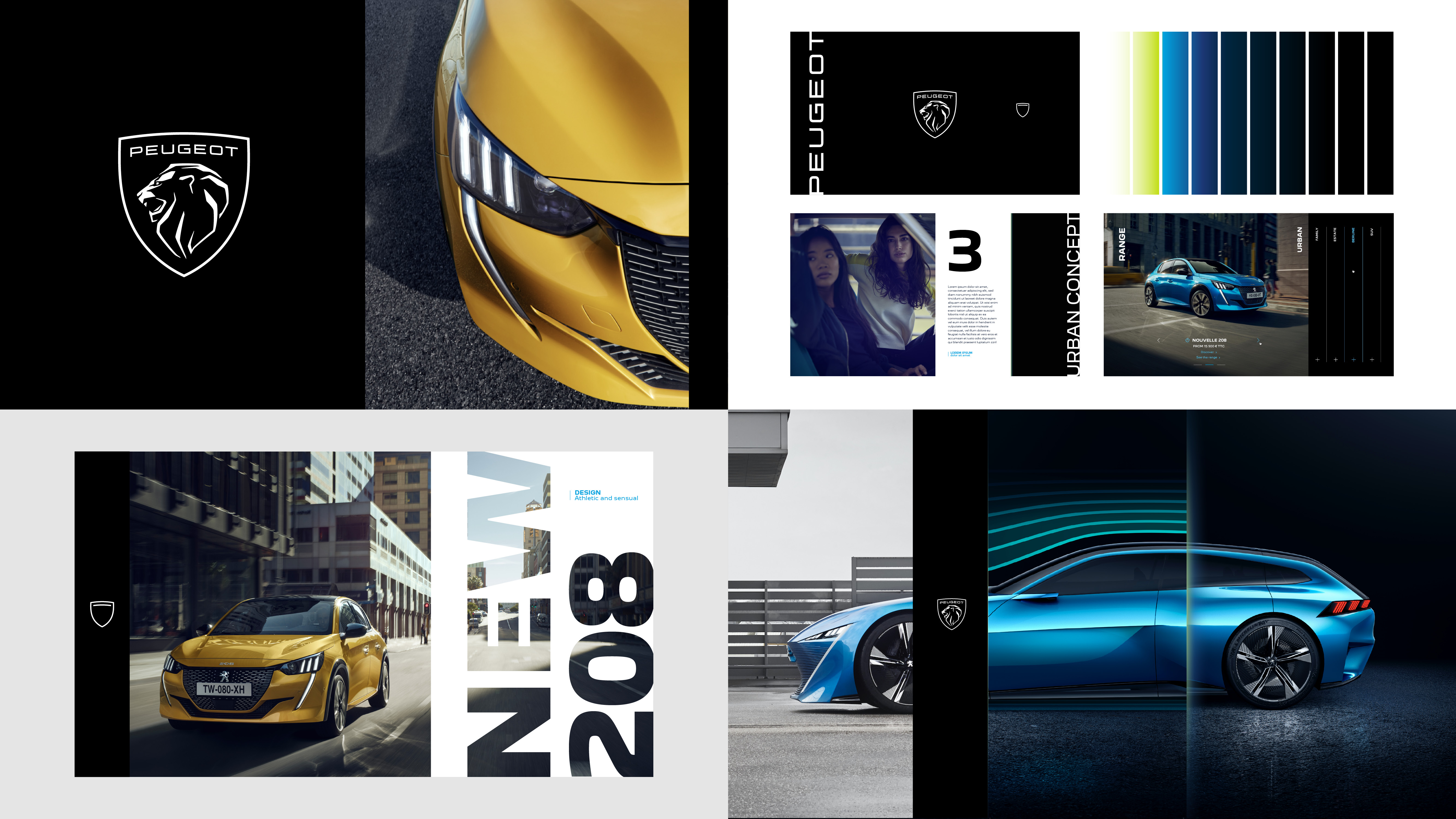
Designed by the company’s own global Peugeot Design Lab, the overhaul—in Peugeot’s words—is more “streamlined,” “qualitative,” “elegant,” and “timeless.”
The brand progression also includes the creation of a ‘Peugeot New’ typeface. At first glance, the font family seems to be made up of rounded sans-serif letters, but you’ll learn later that they’re stabilized with subtly sharp bowls and counters. Their symmetry also depicts Peugeot’s ethos for precision.
The new logo will make its first appearance on the 308 hatchback, before heading to all Peugeot dealerships by 2023.
Click to view enlarged version
Click to view enlarged version. Image via Automobiles Peugeot
Click to view enlarged version
Click to view enlarged version. Image via Automobiles Peugeot
Click to view enlarged version

Click to view enlarged version. Image via Automobiles Peugeot
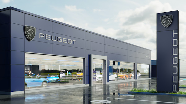
Image via Automobiles Peugeot
[via Autoblog, images via Automobiles Peugeot]
Also check out these recent news


