
Paramount Rescales Its Mountain To Create Logo For Streaming Service
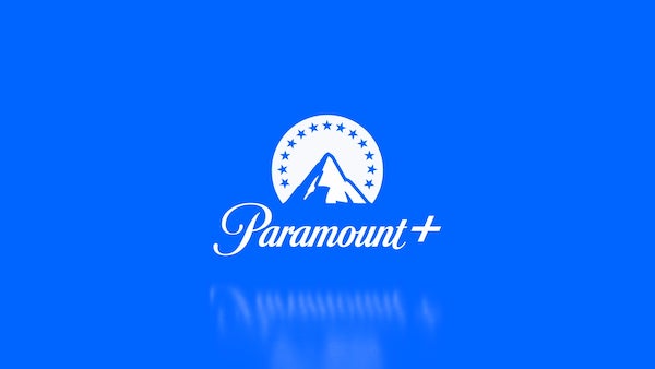
Image via Loyalkaspar
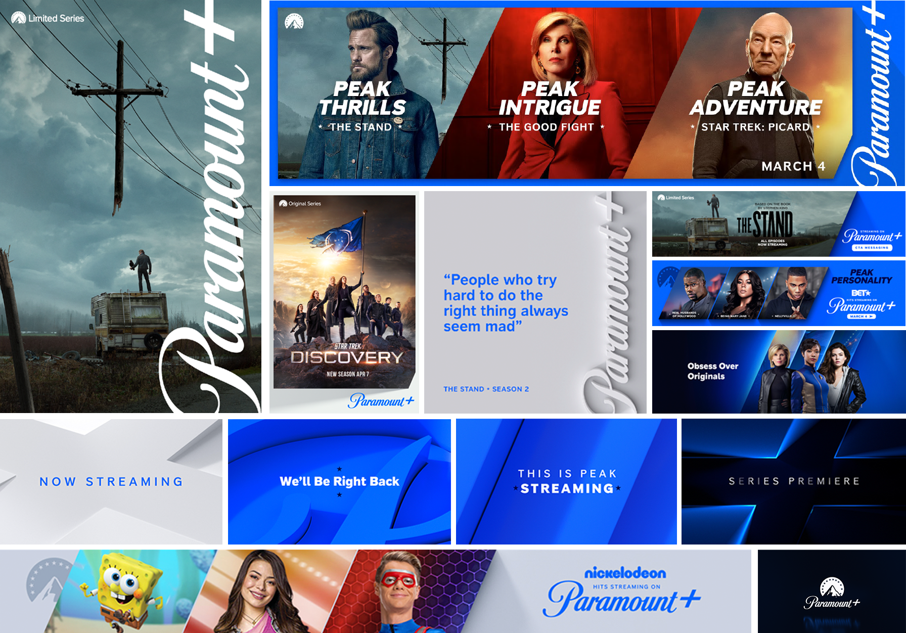
As part of its climb up the streaming industry, against other giants like Netflix and Disney+, ViacomCBS tapped New York-based creative branding agency Loyalkaspar to work on a visual identity for its new streaming platform, Paramount+. The result evidently embraces Paramount’s heritage, but what’s less obvious is that your eyes are ascending a different-looking mountainscape.
To overhaul the former CBS All Access into Paramount+, the design studio found it fundamental to transport Paramount’s “rich heritage and legacy” into the modern era of digital entertainment, Daniel Dörnemann, Loyalkaspar’s executive creative director, told Design Week.
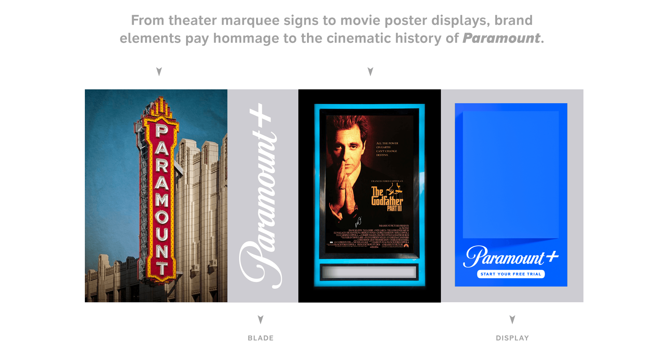
The new Paramount+ thus draws heavily upon Paramount’s old-school and “rich cinematic heritage,” Dörnemann described. For one, there’s a vertical expression of the Paramount+ wordmark inspired by the signage outside film theaters, also known as the “blade.” Animated variations of the Paramount+ logo also move in the way a camera “pans, dollies and cranes.”
Click to view enlarged version
Click to view enlarged version. Image via Loyalkaspar
Click to view enlarged version
Click to view enlarged version. Image via Loyalkaspar
A fresh bespoke typeface, Peak Sans, features upright letterforms that embody typography from the classic marquee sign.
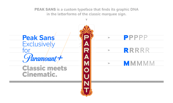
Image via Loyalkaspar
Perhaps most compelling of all is that the Paramount mountain has been redrawn for a streaming service—since the elaborate illustrations for Paramount Pictures and Paramount Network wouldn’t translate for mobile.
The process to streamline and modernize the mountain mark involved “countless sketches,” some so vastly different from the original logo that they ended up ressembling branding for “a mountaineering company,” shared Loyalkaspar chief creative officer Beat Baudenbacher. At the end of the day, the firm decided to work backwards by “tracing the outline of that particular asset, then starting to fill in the light and shadow of that particular lighting scheme,” noted Baudenbacher.
There’s even invisible scaffolding for the Paramount+ opening screen, with the wordmark and call-to-action screen serving as the mountain’s base.
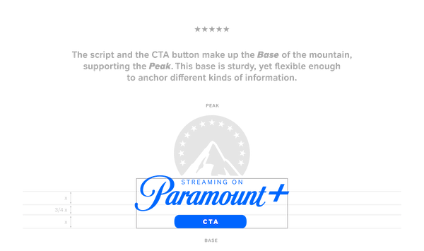
Image via Loyalkaspar
Both the Paramount wordmark and mountain symbol are icons in their own right. With the rebrand, Loyalkaspar made sure they would thrive as standalones.
After moving mountains, Baudenbacher noted that the identity is now “extremely flexible, yet visually cohesive.”
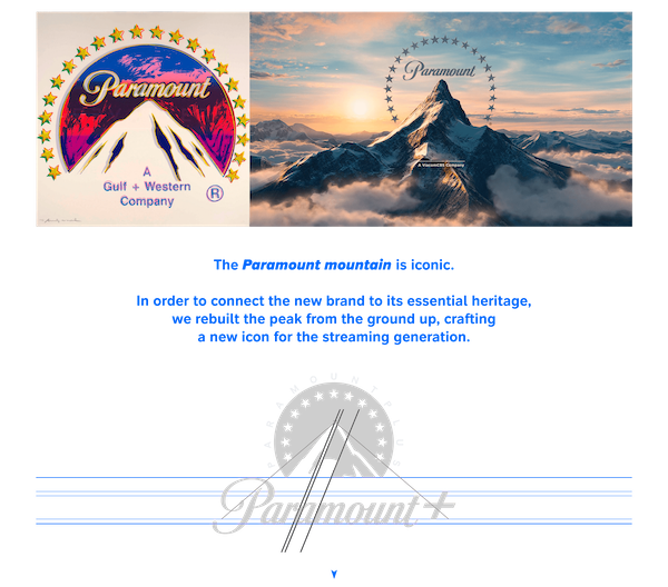
Image via Loyalkaspar
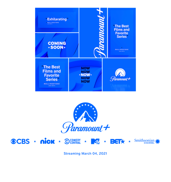
Image via Loyalkaspar
[via Design Week, images via Loyalkaspar]
Also check out these recent news


