
Paramount+’s Logo Has An Infuriating Detail That’s Driving Creatives Peak Wild
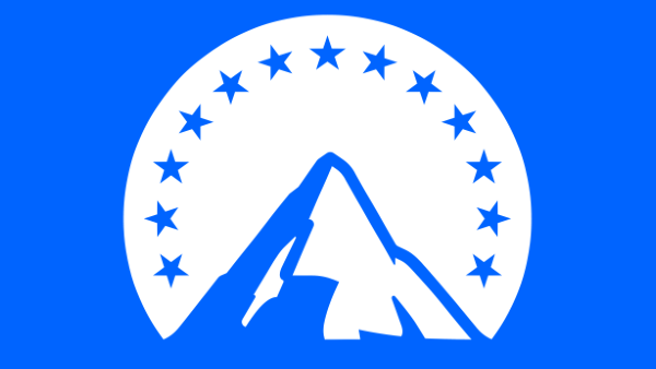
Image via Paramount+
Paramount+ debuted on March 4, and with the launch came a brand new logo, a distilled version redrawn to appear on streaming devices.
Creators of the rebrand shared that it would take “countless sketches” to perfect the mountain icon, as the process involved rebuilding the mountain “from the ground up.” In some iterations, the logo would appear like it was for a “mountaineering company.” Eventually, the team ended with a mark that even had invisible scaffolding to support elements of the streaming service’s opening screen.
In spite of these efforts, one feature of the mountain symbol has proven to be so jarring to some members of the creative community, it detracts their attention from everything else. After social media user aasimpy pointed out that there appears to be a random rounded vector line in the middle of the mountain, shaking that image off their heads has become an uphill battle for some.
“This is my fear as a designer,” one user responded. “That some guy on the internet [is] gonna see a mistake on my design.”
“I wonder if they just uploaded the wrong file and now it’s everywhere,” another shared.
However, one person surmised that there could have been a slimmer line in one of the revisions, “and [the team] didn’t notice it had rounded corners because it was thin.” They wondered if the line had retained its size and shape after the logo was scaled down. Another suggested that this could be a last-minute attempt to separate highlighted areas of the symbol.
For some context, Loyalkaspar, the design studio behind the brand identity, explained that the mountain mark was designed backward by “tracing the outline” of Paramount Pictures and Paramount Network brandings. The team then added highlights and shadows to create an emblem as minimal, responsive, and recognizable as possible, so any one of the two theories could be plausible.
yikes. it looks like someone was instructed to separate the highlights on the left from the highlights on the right, and for whatever reason, they rushed it by tossing in a round-capped stroke. looks too inorganic to be coincidental. https://t.co/OQ53GaYqPq
— Jeeves 🇪🇺🇲🇽🏳️🌈 (@jeeveswilliams) March 21, 2021
Am I crazy - or is this a random vector line? from r/logodesign
Card
[via r/logodesign, cover image via Paramount+]
Also check out these recent news


