
Renault Reveals Sleek Geometric Version Of Its Diamond Logo
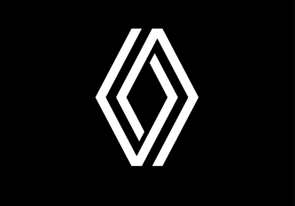
Image via Renault
Renault has revealed a new logo featuring a geometric rendition of its diamond-shaped symbol, which has been in use since 1925.
The new flat logo features two diamond shapes that are intertwined. It appears without a wordmark and can also be lit-up on vehicles and animated for digital media. Designed in-house at Renault, the new wordmark aims to embody a modern brand in a digital world, according to the brand’s design director Gilles Vidal.
“It is a simple geometric shape, with a strong, powerful identity,” Vidal explained. “The challenge was to renew this shape by giving it meaning, new contemporary values to project the brand into the future.”
According to Vidal, the “symbol of the future” strikes a “balance between recognition of the brand’s heritage and entering a new era.”
Renault’s black and white logo appears without any typography and is meant to be “iconic, simple and meaningful” and timeless at the same time.
Renault has been working on redesigning its logo for a few years now, and the release is part of Renaulution strategy, which outlines its ambitions over the next few years. The automaker hopes to make headway in electrics and explore new avenues in the data and mobility sectors.
The entire Renault range of vehicles will feature the new logo by 2024. The new logo can be seen on the grille of the Renault 5 prototype.

Old logo. Image via TY Lim / Shutterstock.com

New logo. Image via Renault
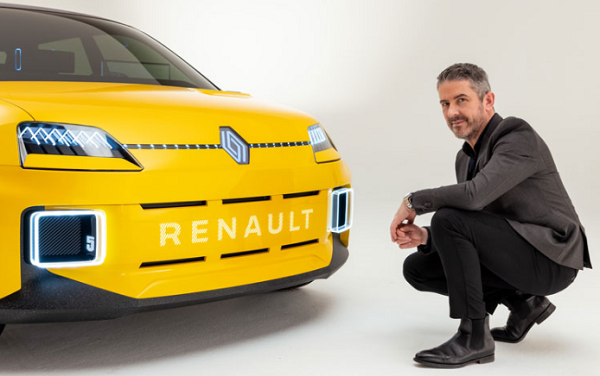
Image via Renault
[via Renault, cover image via Renault]
Also check out these recent news


