
Windows 10’s Redesigned Icons Aren’t As Helpful, But At Least They’re Aligned
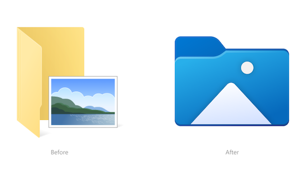
Image via Windows Insider Blog
Microsoft has been busily overhauling the icons of its extensive offerings as part of a multi-year effort for universal consistency. The first shortcuts to get this treatment were the quintessential Office icons, and since then, the company has moved on with revamps for Windows 10 icons for default apps like Alarms & Clock, Calculator, Calendar, and Mail, to embody Microsoft’s Fluent Design.
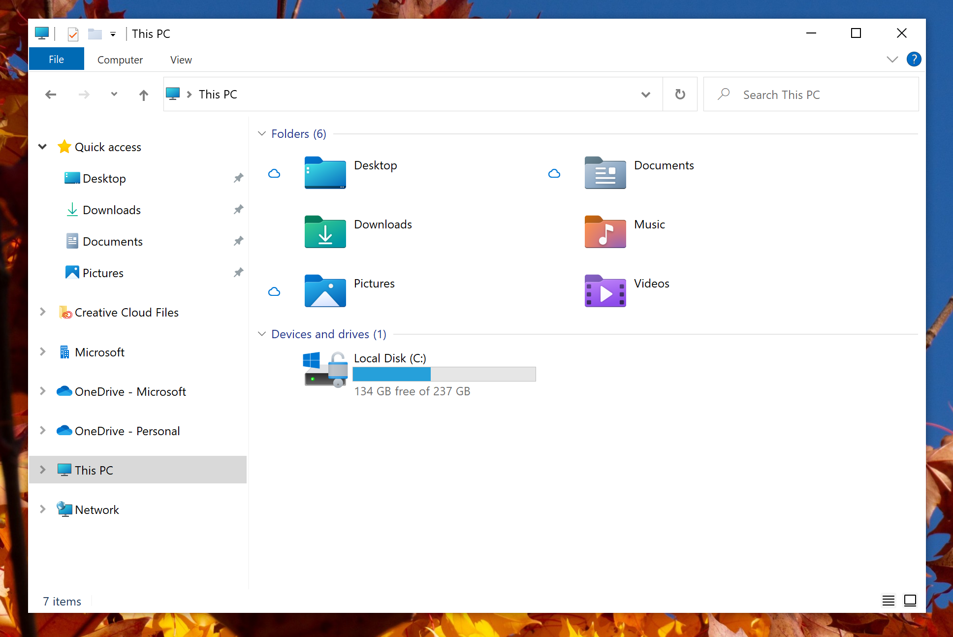
The latest makeovers involve new looks for File Explorer icons, which are now all front-facing and color-coded in Windows 10 Insider build 21343. When displayed together, the icons for the Recycle Bin, folders, and more, decidedly emit visual consistency.
Microsoft explained back in February 2020 that, in its research, it learned that users had “a desire to see consistency in design and connection to the brand.” Design elements also had to be distinct for users to easily spot what they were for.
Click to view enlarged version
Click to view enlarged version. Image via Windows Insider Blog
However, some users, including Bleeping Computer’s Lawrence Abrams, made the valid point that this effort for aesthetical consistency sacrifices another important feature of design: functionality.
With the flat icons, Windows users would no longer be able to preview the files in each folder—though if you’ve been persistently keeping to a mental system when saving or moving your documents, this shouldn’t be too much of a pain.
Microsoft says it is barely scratching the surface for Windows 10 icon revamps, and that “more icons will continue to get updated over time.”
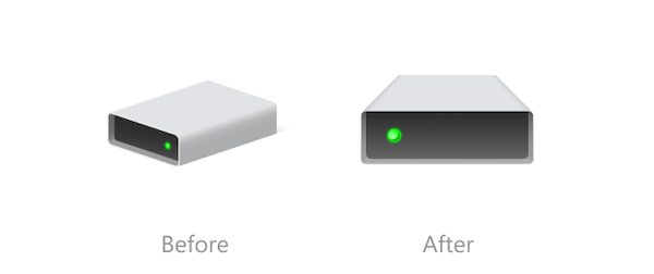
Image via Windows Insider Blog

Image via Windows Insider Blog
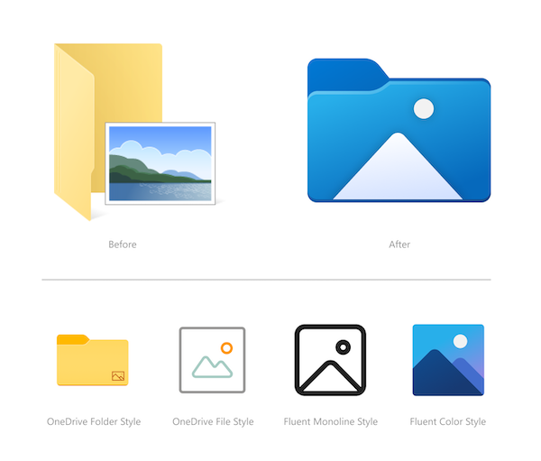
Image via Windows Insider Blog
[via Bleeping Computer, images via Windows Insider Blog]
Also check out these recent news


