
Behind The Design: Original Apple Macintosh Icons That Gave The Computer A Smile
Behind The Design is a segment by DesignTAXI where we wind back to the pioneering products and icons that steered the design world forward and transformed consumer perceptions forever.
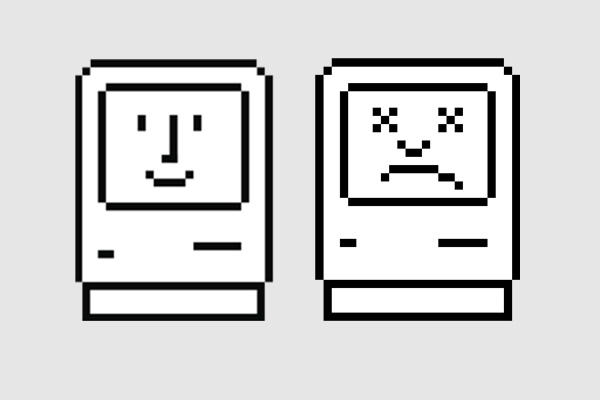
What: Original Apple Macintosh Icons
Who designed it: Susan Kare
When: 1984
In the early 1980s, Apple asked a young artist named Susan Kare to design some graphics for its forthcoming personal computer, Macintosh.
Her memorable suite of icons for the original Macintosh, ranging from the ‘Happy (and Unhappy) Mac’ to the ‘Trash Can’ to the ‘Bomb’, has helped many people learn to navigate the then-unfamiliar technology—the personal computer.
The creative opportunity came about when her friend, Andy Hertzfeld, a member of the Apple Macintosh development team, wanted her to design user interface graphics and font elements for the company’s new operating system. Her business card read "Macintosh Artist."
Kare was taught how to do counted-thread embroidery by her mother, so she applied that knowledge in the creation of the pixelated icons.
However, the requirement of designing the icons on a bit-mapped matrix system was a challenge. Kare then found a solution and started sketching on a simple 32x32 grid paper notebook.
Using each block in the grid as a pixel, she then colored out the mosaic-like squares to create the graphics, and eventually realizing an entire icon collection that gave the Macintosh its distinguished identity and personality.
When asked if Steve Jobs directed her design process, Kare said “Steve definitely looked over options and expressed his preferences. We used to joke that it was never a good idea to show him one of anything, because he could reject it.”
After her time with Apple, Kare went on to set up her own design firm in 1989, where she went to design graphics for other tech giants like IBM, Microsoft and Facebook.
Other notable works by Susan Kare include Microsoft’s ‘Solitaire’ and virtual gift icons for Facebook.
[via CNet, Smithosonian Magazine, Boing Boing]
What: Original Apple Macintosh Icons
Who designed it: Susan Kare
When: 1984
In the early 1980s, Apple asked a young artist named Susan Kare to design some graphics for its forthcoming personal computer, Macintosh.
Her memorable suite of icons for the original Macintosh, ranging from the ‘Happy (and Unhappy) Mac’ to the ‘Trash Can’ to the ‘Bomb’, has helped many people learn to navigate the then-unfamiliar technology—the personal computer.
The creative opportunity came about when her friend, Andy Hertzfeld, a member of the Apple Macintosh development team, wanted her to design user interface graphics and font elements for the company’s new operating system. Her business card read "Macintosh Artist."
Kare was taught how to do counted-thread embroidery by her mother, so she applied that knowledge in the creation of the pixelated icons.
However, the requirement of designing the icons on a bit-mapped matrix system was a challenge. Kare then found a solution and started sketching on a simple 32x32 grid paper notebook.
Using each block in the grid as a pixel, she then colored out the mosaic-like squares to create the graphics, and eventually realizing an entire icon collection that gave the Macintosh its distinguished identity and personality.
Sketches by Susan Kare, who designed the famous Mac icons. pic.twitter.com/FghgsoVfR3
— WEIRDLAND TV (@WeirdlandTales) December 27, 2018
When asked if Steve Jobs directed her design process, Kare said “Steve definitely looked over options and expressed his preferences. We used to joke that it was never a good idea to show him one of anything, because he could reject it.”
After her time with Apple, Kare went on to set up her own design firm in 1989, where she went to design graphics for other tech giants like IBM, Microsoft and Facebook.
Other notable works by Susan Kare include Microsoft’s ‘Solitaire’ and virtual gift icons for Facebook.
The original #Macintosh icons by Susan Kare are awesome! #icons #interface pic.twitter.com/RXEQ4cfvmR
— MacPaw (@MacPaw) July 4, 2014
For today's edition of Over the Years, we're looking at the change in Macintosh icons!
— Yellowchalk Design (@YellowchalkUIUX) December 19, 2020
Susan Kare designed the original Apple Macintosh icons. Many of the visual metaphors are still in use today.#design #icon #icondesign #icons #mac #macintosh #macintoshicons #ui #ux pic.twitter.com/5qizNBeaI8
[via CNet, Smithosonian Magazine, Boing Boing]
Also check out these recent news


