
Xiaomi Ridiculed After Spending 3 Years On New Logo That Looks Like The Old One
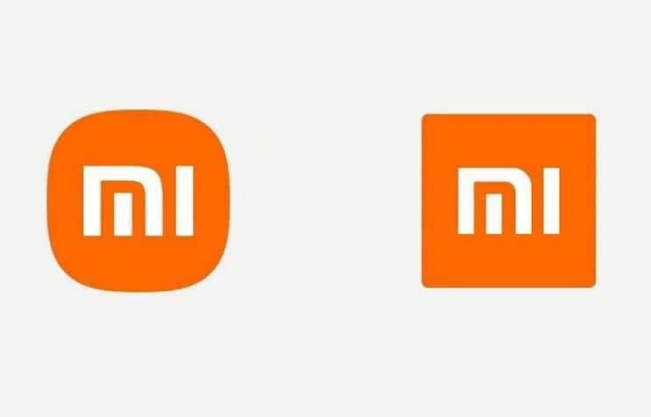
New logo (left) VS old logo (right). Image via Xiaomi
Xiaomi has revealed a new logo as part of a bigger overhaul of its brand identity.
The new logo was designed by the art director of Japanese retailer MUJI, Kenya Hara. It adopts a softer, rounder contour on the corners of the original squared logo, along with redesigned “MI” typography.
The company retained its bold orange hue as it conveys the “liveliness and youthfulness” of Xiaomi. It also introduced black and silver as supplemental colors to accommodate high-end product line applications.
The new symbol is said to have cost two million yuan (US$305,000) to create. Although Xiaomi hasn’t confirmed it, social media users were appalled at the reported price tag.
“I think Boss Lei [Jun] got scammed,” a Weibo user said. “I suggest that Xiaomi call the police.” Another user said, “I can do this for 20,000 yuan. Or 2,000.”
The revamped logo took three years to design, and Xiaomi’s CEO Lei Jun acknowledged that it might appear underwhelming to some people. In an article published on his official WeChat account, Lei said that the change represents an upgrade of the company’s “internal spirit and qualities.”
Hara used the “superellipse” mathematical formula when he was creating the new logo, per Xiaomi’s website. The logo is a “perfect balance between a square and a circle,” and the curves of the “MI” were also adjusted to match the rest of the design.
Lei said that he loved that Hara incorporated “thinking from Eastern philosophy” into the new symbol.
While some social media users weren’t too impressed by the slight tweak in the design, others said that the story behind the new look is more important than the actual changes themselves.
A Logo That Feels "Alive"#InnovationForEveryone pic.twitter.com/oimhPHZohK
— Xiaomi (@Xiaomi) March 30, 2021
New year. New look. New us.
— Xiaomi (@Xiaomi) March 30, 2021
Together with @haraken_tokyo, we've changed our logo! How do you like our new logo? #XiaomiMegaLaunch pic.twitter.com/bqi33ZC3vE
Its a joke?
— Tahiche MM 🔻 (@TahiSama) March 30, 2021
NICEEE
— ZAFAR KHAN (@ZAFARKHAN702) March 30, 2021
SO INNOVATIVE
Same logo.. Just rounded corners. That's not a new logo
— Nelly Mchoraji (@MusiomiArt) March 30, 2021
Let's hear from @haraken_tokyo and the story behind our new logo design. #XiaomiMegaLaunch pic.twitter.com/FGkXJXM1nK
— Xiaomi (@Xiaomi) March 30, 2021
[via The Star, cover image via Xiaomi]
Also check out these recent news


