
Apple’s New Music For Artists App Icon Could Hint At A Massive iOS 15 Redesign
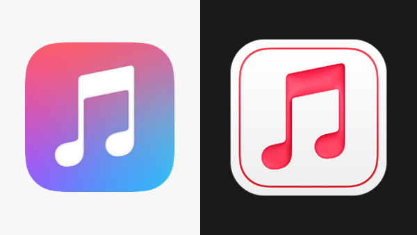
Old icon (left) VS new icon (right). Images via Apple
With all hands on Microsoft’s deck as it overhauls its icons in an ambitious multi-year project, Apple seems to also be kept busy with a revamp of app icons, albeit at a more modest pace.
This week, the Cupertino tech giant silently gave the Apple Music for Artists icon a facelift as part of an update covering minor fixes and improvements. The new look was spotted by MacRumors.
As opposed to the former gradient icon of pinks, purples, and blues, the new logo features an off-white background with pinkish-red rims and some drop shadows, along with a music note that seems cut-out.
Right off the bat, the icon appears to have more contrast to instantly draw attention to the eye.
For context, the Apple Music for Artists app shares performance insights for musicians across Apple Music, iTunes, and Shazam.
The publication, as well as some Apple users, have noted that this isn’t the first icon to have received this visual treatment. Back in October, the company splashed the App Store Connect icon with the same “embossed” look:
I didn’t realize how drop-shadowy MacOS Big Sur was until I saw the new iOS App Store Connect icon today. It’s like everything has been run through a bevel and emboss filter. This new design direction shocks me but for a generation raised on flat design it probably looks fresh😉 pic.twitter.com/2wVIUSWQlY
— Protopop Games (@protopop) October 8, 2020
The updates have led fans to presume that a whole array of new iOS 15 icons is underway. As pointed out by one user, a minimalist color scheme might make it easier for Apple to adapt its visual system to dark mode.
With Apple’s 2021 Worldwide Developers Conference (WWDC) kicking off only in June, it’s possible that users will have a few more peeks of a possible iOS makeover during the leadup.
This is urgent information, see the App Store Connect icon made in the style of macOS Big Sur, but now Apple has updated the Apple Music for Artists icon which is now in the same style, this now definitely means that the new Material design will be in the new iOS 15? pic.twitter.com/MD7nVfcdvI
— Apple Lab (@aaple_lab) April 6, 2021
[via MacRumors, cover image via Apple]
Also check out these recent news


