
Magnum Refreshes Visual Identity With Sweet, Elegant Logo That Exudes Indulgence

Left: Old logo Right: New logo Image via Magnum
Ice cream brand Magnum has teamed up with design studio Sunhouse to refresh its visual identity. The new look aims to evolve the idea of pleasure as a liberation to be enjoyed by all.
The rebrand was driven by the need to recapture the brand’s distinctiveness and stand out from its competitors. Sunhouse was tasked to strengthen the brand from inside-out, define the strategic brand principles that would inspire Magnum’s brand, and redesign the current packaging to align with the new positioning as a “liberated force of pleasure.”
Magnum’s new liberation expression is guided by these principles to inspire fearlessness, confidence, and sensorial indulgence. The gold and brown M-logo has been flipped to elevate the iconicity. Sunhouse has removed the bling from the wordmark, making the whole look more elegant yet contemporary at the same time. According to the agency, the new M-angle seeks to amplify the brand’s most powerful asset, “the crack-and-cream experience.”
For its packaging, Sunhouse gave a rather bold and fun look to pair with the elegant logo. The packaging sees bright hues including purple and pink hues with lines and borders running across the ice cream boxes, giving off a sense of freedom.
“As the democratization of culture and fashion begins to shift our perception of luxury, Magnum ran the risk of becoming stiff and contained. Our challenge was to set it free by pushing it off its pedestal without losing any of its aspirational allure and desirability,” says Sally Knapton, senior account director at Sunhouse.

Image via Magnum
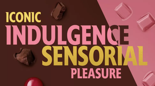
Image via Magnum
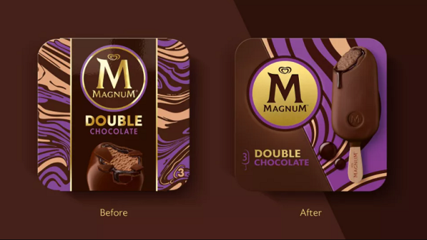
Image via Magnum
[via Creative Bloq, cover image via Magnum]
Also check out these recent news


