
This Twisty Typeface Is Designed To Resemble The Human Colon For A Good Reason
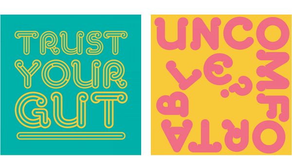
Image via Taxi Studio
Bristol creative agency Taxi Studio has unveiled a twisty, colon-shaped typeface as part of new branding for a bowel cancer charity.
Never Too Young, a project group from the Bowel Cancer UK charity, is led by a team of young people diagnosed with the cancer. The initiative aims to raise awareness that the risk of bowel cancer can be present at any age.
The agency worked together with the charity to design a typeface that represents findings and facts of bowel cancer. Dubbed ‘Sophia Display’, which is named after the group’s founder Sophia Sangchi who died in 2019, the font family is a collection of twisted letters that look just like the human colon.
The letters are used to write out catchy phrases such as “trust your gut” and “know your s**t”. The branding’s supporting phrases were developed by agency Reed Words.
The typeface, which is also available in a bold option, is also seen in Never Too Young’s branding. The letters are printed in bright, punchy colors to appeal to the younger masses.
The colon motif was created by Taxi Studio collaborator Tom Lane. “We devised ways to use the colon throughout its brand expression, from being part of the logo itself to a headline to appearing as ratios, times, fractions, and even loo rolls – each designed to help drive awareness of key symptoms to be aware of at every touchpoint,” Taxi Studio explained.
The studio further added that that the typeface aims to “represent the existing younger bowel cancer community” while grabbing the attention of those who are unaware of the problem. The typeface will also be found on Never Too Young’s merchandise, which includes tote bags, t-shirts, and loo rolls.
Know the signs of #bowelcancer
— nevertooyoung (@nevertooyounguk) April 20, 2021
We all know bowel cancer sucks but if more people know the signs that’s more people having a chance at an earlier diagnosis
Let’s get people knowing their bodies & knowing their s**t
Watch the below ⬇️#nevertooyoung #BowelCancerAwarenessMonth pic.twitter.com/uuSx82cUOn
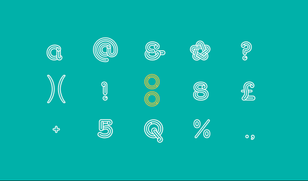
Image via Taxi Studio

Image via Taxi Studio
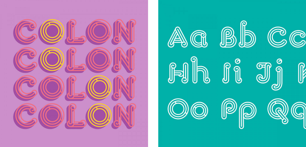
Image via Taxi Studio
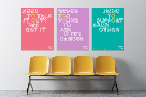
Image via Taxi Studio
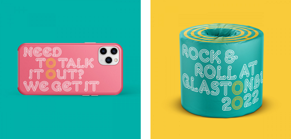
Image via Taxi Studio
[via Dezeen, cover image via Taxi Studio]
Also check out these recent news


