
Shangri-La Hotels Reveals Calligraphy-Inspired Logo Refresh For 50th Anniversary

Image via Andy Feng / Shutterstock.com
To celebrate 50 years in the hospitality business, Singapore-born hotel and resort chain Shangri-La has unveiled an elegant brand update that nods at both its past and its expectations for the future.
What does that even mean? Quite simply, the hotel chain is bidding farewell to the retro, oriental-esque logomark and is instead adopting a typeface with slimmer block letters. It maintains its edge and recognition of its Asian roots with a balanced wordmark inspired from Asian calligraphy, most evident in the brushstroke-like leg of the ‘R’.
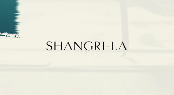
Video screenshot via Shangri-La Hotels and Resorts
Shangri-La explains that the dainty revamp is a “subtle but purposeful” symbol of its renewed promise for more memorable moments to come. Also gone is the removal of “Hotel and Resorts” from the logo to crystallize its role as “a feeling and an experience,” rather than a place.
The hotel has also given its monogram, an emblem portraying mountains being reflected in tranquil waters, a gold finish to evoke the sunrise, too. The symbol depicts a warm and cozy personal sanctuary.
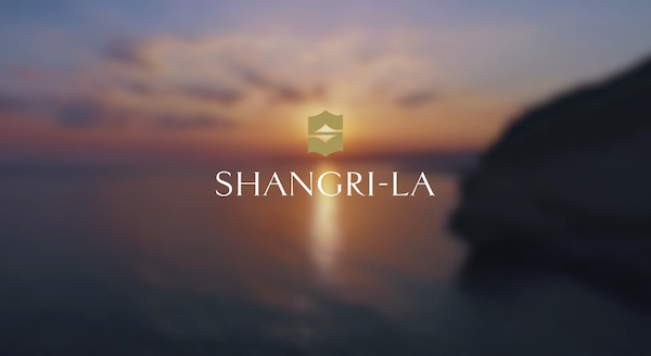
Video screenshot via Shangri-La Hotels and Resorts
[via LoyaltyLobby, images via various sources]
Also check out these recent news


