
Microsoft Is Replacing Calibri As A Default Typeface With 1 Of These New Options
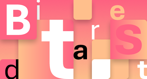
Image via Microsoft
As most users of Microsoft Office know, Calibri has been the default typeface for all things Microsoft since 2007, when it replaced Times New Roman. Now, the tech company is taking a step forward and changing its go-to font family for the new decade.
Microsoft commissioned five original, custom fonts that are now available in Microsoft 365 for everyday use. It knows everyone will have an opinion, and has invited users to vote on their favorite here.
We need to talk. What should our next default font be? pic.twitter.com/fV9thfdAr4
— Microsoft (@Microsoft) April 28, 2021
‘Tenorite’ by Erin McLaughlin and Wei Huang
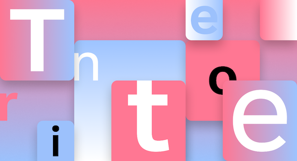
Image via Microsoft
Tenorite has the rather traditional look of a simple sans-serif typeface, but has been designed to evoke a warmer and more friendly vibe.
Elements such as large dots, accents, and punctuation make Tenorite comfortable to read at small sizes on screen too.
‘Bierstadt’ by Steve Matteson
Image via Microsoft
For those who like their letters precise, Bierstadt could be what you’re looking for. Inspired by mid-20th-century Swiss typography, it’s a versatile typeface that’s highly readable and clear with stroke endings that emphasize order and restraint.
‘Skeena’ by John Hudson and Paul Hanslow
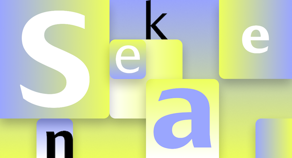
Image via Microsoft
Skeena is a humanist sans serif, based on shapes of traditional serif letters. There’s a noticeable contrast between thick and thin strokes, making it ideal for body text in long documents. It also offers a more dramatic impact when used at larger sizes as titles or headers.
‘Seaford’ by Tobias Frere-Jones, Nina Stössinger, and Fred Shallcrass
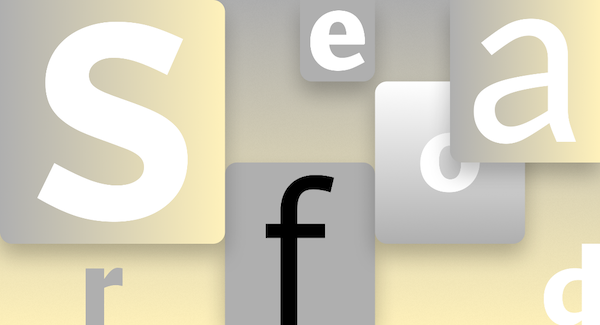
Image via Microsoft
Seaford, one of the more organic typefaces of the bunch, is a sans-serif typeface based on old-style serifs used in the past. Its asymmetric forms aid in reading by emphasizing subtle differences between letters, creating easier-to-read word shapes.
‘Grandview’ by Aaron Bell
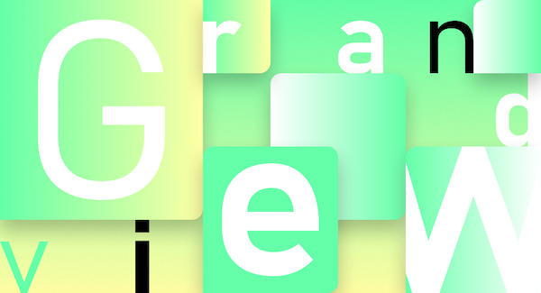
Image via Microsoft
Grandview is the last typeface of the group, derived from classic German road and railway signage, and is meant to be legible even from afar. It’s designed with the same qualities of readability, with adjustment made to make it a comfortable read in long-form body copy.
You can download all five typefaces via the cloud and use your favorite across all Microsoft 365 apps.
[via Microsoft, images via Microsoft]
Also check out these recent news


