
Discord’s New Logo Sows Discord Over Its Font Choice
Image via Discord
Discord turned six on Wednesday, and to celebrate its birthday, the instant messaging platform unveiled a new logo complete with an updated typeface, mascot, and shade. Unfortunately, its typographical choice has left users feeling a little blue—or like how Discord now prefers to call it, Blurple.
The antennas of ‘Clyde’, which is supposedly the mascot’s name, have been tweaked to “look a bit more like shoulders,” and he can now express himself through a gamut of facial expressions. The Discord team also replaced its primary faded blue with a deeper ‘Blurple’.
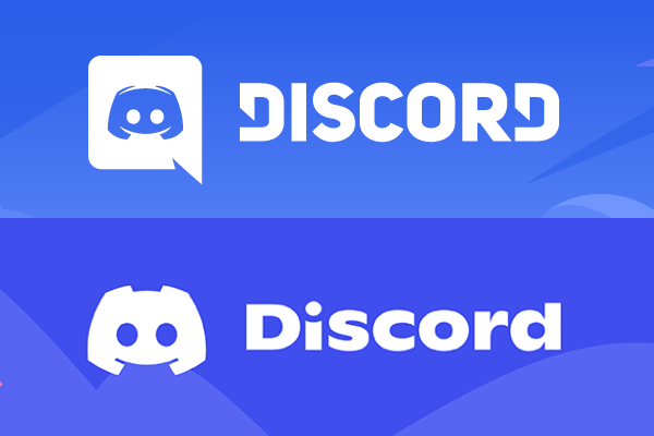
Old logo (above) VS new logo (below). Images via Discord
Despite there being a character icon in the wordmark, fans think much of the character comes from the text in the logo. So when Discord swapped out its all-caps futuristic logomark with a version that includes lowercase letters, it sparked an uproar, as per Video Games Chronicle.
In fact, when one Twitter user challenged the community to help “pick a better font,” his tweet prompted over 1,100 comments.
Contrary to what some might believe, Discord explained that it had “agonized over” the wordmark, which it said was the result of experimentation with “hundreds of different fonts” to perfectly capture the platform’s playfulness. It eventually settled on a custom typeface based on Ginto, a geometric-humanist typeface.
The company elaborated, “The biggest thing that we debated, changed, changed back, changed back again, agonized over… was whether we should keep the wordmark in all caps or in title case… In the end, we decided that Title case — making sure it’s always capitalized like someone’s name — made our new wordmark more legible.”
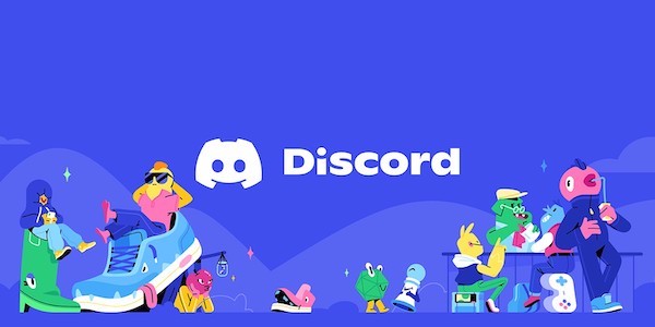
Image via Discord
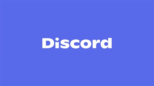
Image via Discord
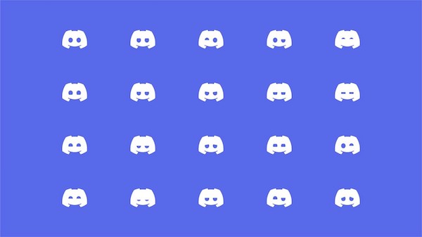
Image via Discord
When the fonts fail to load on your PC. pic.twitter.com/5dvOHj87QY
— Mutahar (@OrdinaryGamers) May 13, 2021
this really the look you going for? pic.twitter.com/bJVnQ7YduJ
— toronto 🏳️⚧️🏳️🌈 #saveprodigalson (@AGAINSTPROTOCOL) May 13, 2021
@discord Change the letters to all caps, works better pic.twitter.com/39XwY0S4lX
— Pelo (@_SrPelo_) May 13, 2021
new discord logo is really gonna bring in the dollars now pic.twitter.com/vvUgzbZDhB
— icy | SPLATOON 3!!! (@icycrys70771) May 13, 2021
monsterrat bold fixes everything, and that’s a life lesson you can take to the bank
— Ohxists (@ohxists) May 13, 2021
new discord logo looks like it would suspend my account for saying boob pic.twitter.com/2t9CVUSqzH
— The Plasnya Membrane (@howdy_nyall) May 14, 2021
[via Video Games Chronicle, images via Discord]
Also check out these recent news


