
How Famous Brands Would Appear If They’d Stuck With Their First Logos
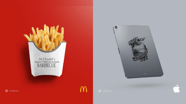
Images by Thomas J. Stevens and featured with permission
Without that red and yellow monogram, how else would you know to stop for a quick bite?
Whenever a brand revamps its logo, there’ll always be that one detractor who criticizes it without logic. However, evolution is essential, and these concepts by branding specialist Thomas J. Stevens of tjscreates prove it.
Imagining how products and packaging of world-renowned companies would have appeared if they had never mustered the courage to rebrand, Stevens visualizes items from these brands with their very first logos. Laid out in this manner, the original brandings are glaringly outdated—illegible and unfit for modern displays to the point of looking scraggly.
Stevens stresses that the elements that make modern-day rebrands so successful are that they’re memorable, versatile, simplistic and scalable. There’s no way Apple could have designed those MacBooks with light-up logos if it had retained the elaborate illustration of Isaac Newton. Neither would the Starbucks siren call out your name with an obscured face.
The branding expert reckons these mockups could help out creatives who have had trouble convincing their clients to redesign their brand identities. Stevens also dishes out cool branding advice on his Instagram, which you should check out here.
Images by Thomas J. Stevens and featured with permission
Image by Thomas J. Stevens and featured with permission
[via Creative Bloq, images by Thomas J. Stevens and featured with permission]
Also check out these recent news


