
Calendly’s $1.5M Logo Designed By Pentagram Runs Aflush With Toilet Jokes
Image via Pentagram / Calendly
For the uninitiated, Calendly is one of the leading cloud-based scheduling platforms on the market. It offers over 10 million monthly active users a fuss-free way to manage their calendars, integrating other platforms such as Google Calendar, Microsoft Outlook, Slack, and Zoom.
However, the company’s new brand identity, created by design studio Pentagram, has received less-than-great reviews about the logo design.
According to Creative Bloq, it’s been rumored that Calendly spent US$1.5 million on the rebranding effort, only to have its logo resemble the bird’s-eye view of a toilet seat.
The new logo features a rounded hexagon shape inside a hollow ‘C’. While Pentagram said the new branding “introduces a new brand mark and logotype that are an evolution of previous versions, with a stronger and more modern presence,” it seems most users on Twitter have taken it in the opposite direction, instead.
Take a closer loo-k at the updated logo below.
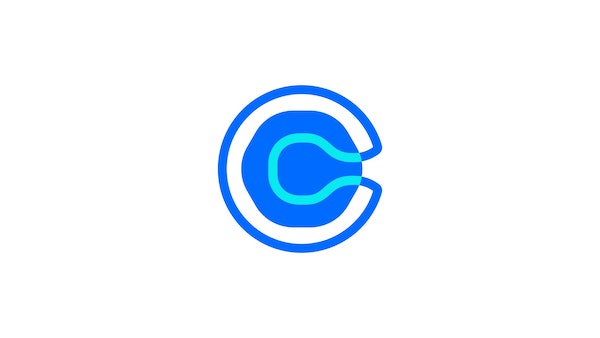
Image via Pentagram / Calendly
hold on.. calendly spent $1.5M on a new logo that looks like a bird’s-eye view of a toilet?
— Jay 🚀 (@MisterJHuffman) June 14, 2021
lmao, fire whoever made that decision yesterday. pic.twitter.com/lYjW5o9c5J
This is Calendly's new logo. I am logging off. pic.twitter.com/Zm89GkTEkw
— Gay Rich Tia (@breedaddy_mp3) June 11, 2021
Calendly's new logo cost $1.5m pic.twitter.com/Dja2RzA3pc
— Daniel Pikl (@danielpikl) June 14, 2021
[via Creative Bloq, images via Pentagram / Calendly]
Also check out these recent news


