
LA Unveils Striking Logo Capturing Its Personality, Designed By Shepard Fairey
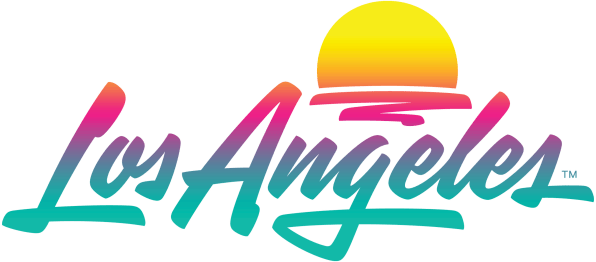
Image via Los Angeles Tourism & Convention Board
Designed in collaboration with Shepard Fairey’s Studio Number One and House Industries, the Los Angeles Tourism Board has unveiled a striking new logo inspired by key characteristics of the city.
Los Angeles’ new logo draws from Art Deco, hand-painted signage, and Mexican restaurant script. Its gradient colors are meant to show the city’s diversity, but also pay homage to its well-known sunsets.
The previous emblem was also a scripted font, so this one doesn’t stray too far from the already-established aesthetics, since this is the first rebrand the Los Angeles Tourism board has carried out in a decade.
Other reference points include California-based artist Ed Ruscha’s painted gradients, as well as the countless airbrushed custom cars which flock the city’s streets.
As lockdown restrictions begin to lift and cities are welcoming tourism again, the logo comes at an apt time for the city to roll out its new ad campaign, kicking off early this week.
“The point was to make it open to interpretation for different people,” Fairey said in a statement obtained by Fast Company. He also wished to set the LA motif apart from “what other cities are doing,” and described it as having a “strong, ownable personality.”
The city’s chief marketing officer, Don Skeoch, also noted the two major challenges; firstly, something appealing to both tourists and businesses; and secondly, something that didn’t lean too much on the LA abbreviation, as it could be read as la, which is Spanish and French for “the.”
The design “allows anyone to project something about themselves onto it,” Fairey concluded. Indeed, the city which is famous for being the city of dreams, now has a logo to epitomize all of the potential it has to offer.
[via Fast Company, images via Los Angeles Tourism & Convention Board]
Also check out these recent news


