
BBC Defends Logo Refresh Reported To Cost ‘Tens Of Thousands Of Pounds’
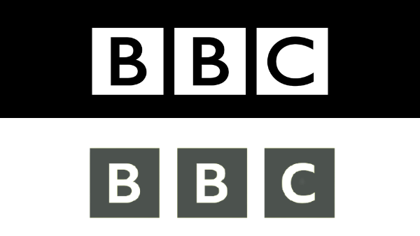
Old logo (above) VS new logo (below). Images via BBC and BBC Select
The BBC has been dealt with Big, Brutal Contempt due to a subtle logo change that it quietly rolled out this year. In hindsight, it was a good thing that the network had kept mum about the change, because internet users have hawked in and are complaining about taxpayers’ money being “wasted” over a nearly identical version.
The fresh branding, a refresh rather than a redesign, features a smaller font and wider kerning between even initial.
The Sun alleged that the new design system cost “tens of thousands of pounds,” while Talkradio presenter Mike Graham cited an estimate of £50,000 (US$69,000).
The reports caused an uproar on social media, with users expressing that they felt ripped off. “[I’d have done] that for them and it would have cost them a KitKat,” one person wrote.
The BBC is now stepping in to justify the change, whose cost it argues is not “significant.”
“We are simply using our own font – which we own the intellectual rights to – to tidy up the blocks when we update content or BBC products,” a spokesperson for the broadcaster tells Metro.co.uk.
The typeface in question is BBC Reith, named after John Reith, and it replaces the existing use of Gill Sans.
In line with the BBC’s reasoning, Twitter users familiar with branding design explained that swapping to an in-house typeface would be beneficial in the long run, since the BBC would no longer have to pay for licensing fees to use Gill Sans.
The change had flown over most heads for some months, having been used by streaming service BBC Select since February. The BBC will officially adopt the new logo on television screens in the fall.
Sigh. The BBC logo change is so they no longer have to pay rights for the old font - the Reith font was designed in-house for just this reason - it will save money in the long run. https://t.co/KYRO71CCTr
— Chris Merriman (@ChrisTheDJ) July 5, 2021
[via NME, Metro.co.uk and Creative Bloq, images via various sources]
Also check out these recent news


