
Clorox Redesigns Corporate Logo To Remind That It’s Not All About Wipes
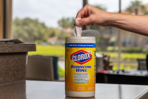
Image via John Mantell / Shutterstock.com
From Burt’s Bees lip balms to Glad food wraps, The Clorox Company is so much more than cleaning products. And yet, disinfecting wipes are mostly what customers—and, by extension, investors—think of when the name comes up.
The association is so strong, there was a shortage of Clorox wipes when COVID-19 kicked in and sparked a stockpiling frenzy, Fortune reports. The pandemic saw a spike in sales, but as business eventually slowed down, the weaker performance of Clorox’s other brands became glaringly apparent.
To shake off this one-dimensional view and hopefully boost sales between its other subsidiaries, The Clorox Company has dusted off the ‘diamond’ in its corporate logo, an iconic shape in the branding for Clorox cleaning products.
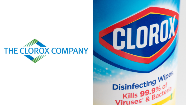
The previous corporate logo, whose diamond emblem often brings Clorox cleaning products to mind. Images via The Clorox Company and Tada Images / Shutterstock.com
The new wordmark is a simplified version with a rounded typeface and an angular ‘C,’ reminiscent of a camera’s aperture.

The new corporate logo. Image via The Clorox Company
“That takes us away from just the diamond, which very much represents the Clorox brand and feels like it is more inclusive of our entire company,” said Clorox’s chief marketing and strategy officer Stacy Grier in a statement obtained by Forbes.
Some might argue that too much Clorox product was used to water the logo down, but the logomark needs to be versatile to represent the brand’s entire portfolio, and that’s not easy to do.
Our purpose -- to champion people to be well and thrive every single day -- has never been more clear. We wanted our corporate logo to reflect that. Launched today, our new corporate brand reflects who we are, what we stand for and what we aspire to be. https://t.co/cqhRX5GQIb
— The Clorox Company (@CloroxCo) July 12, 2021
[via Fortune, images via various sources]
Also check out these recent news


