
Visa Rolls Out Global Rebrand With A Text-Free Symbol For A Fully Digital World
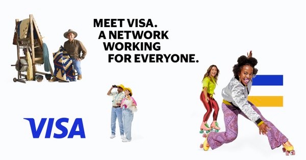
Image via Visa
From the early days of credit cards to the emergence of digital payments, where cashless payments are made, Visa exists. However, the credit card company believes that, while customers recognize the name, they don’t know who Visa is.
“People think they ‘know’ Visa. Consumers and businesses trust the power of those four letters and see it when they open their wallet, pay a vendor, walk into a store or check out online,” shared Visa executive vice president and global chief marketing officer Lynne Biggar in a press release. “What they don’t see is how those four letters operate the most dynamic network of people, partnerships and products.”
Embracing the acclaim it has accumulated over the past 60 years, Visa has unveiled a new global brand identity built on this recognition and trust. It then probes further to “Meet Visa” in a marketing campaign led by advertising giant Wieden+Kennedy and a film directed by Malik Hassan.
From day one, the company has had one question in mind: “What if money became fully electronic?” It was also founded on the grounds of pushing a payment network to “everyone, everywhere.” More than half a century later, the meanings of “electronic” and “everyone, everywhere” have evolved beyond plastic cards and physical payment systems. Gig economy works can now be paid in real-time, while transactions can be processed at the tap of a button.
For a new cashless era, Visa tapped boutique design studio Mucho to rework its visual identity. Rather than reinvent the wheel, the studio amplified the visibility of Visa’s blue and gold—with the company’s long-standing reputation, there’s no longer a need for the Visa name and colors to co-exist on one plane.
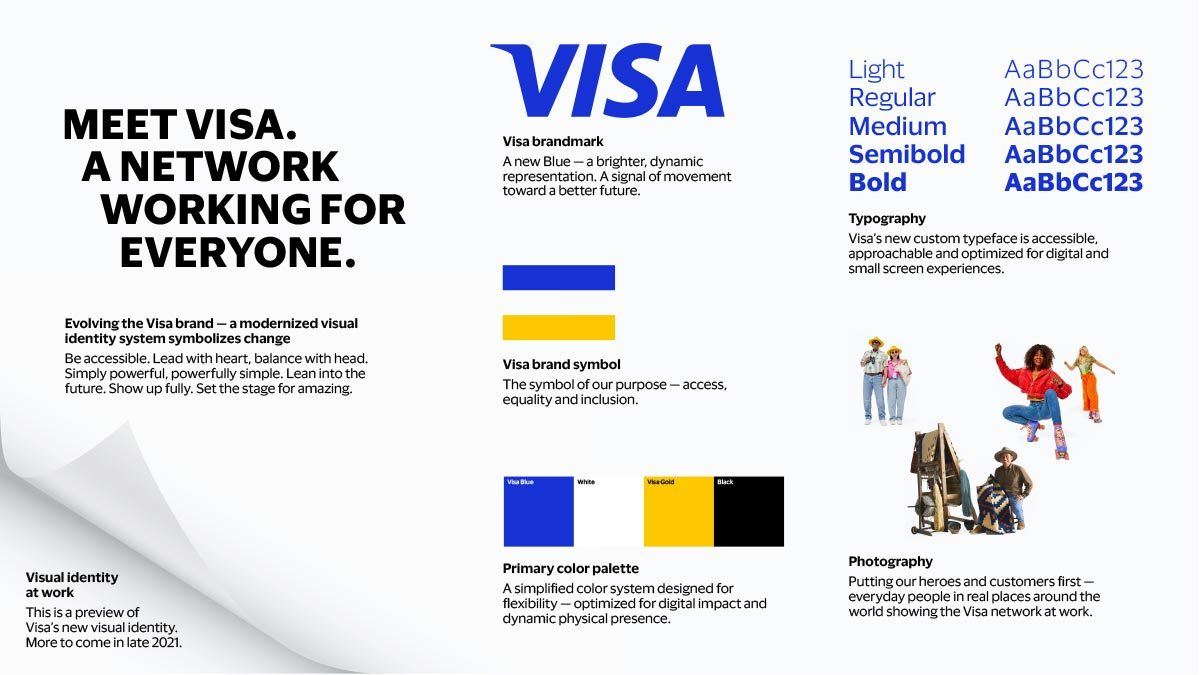
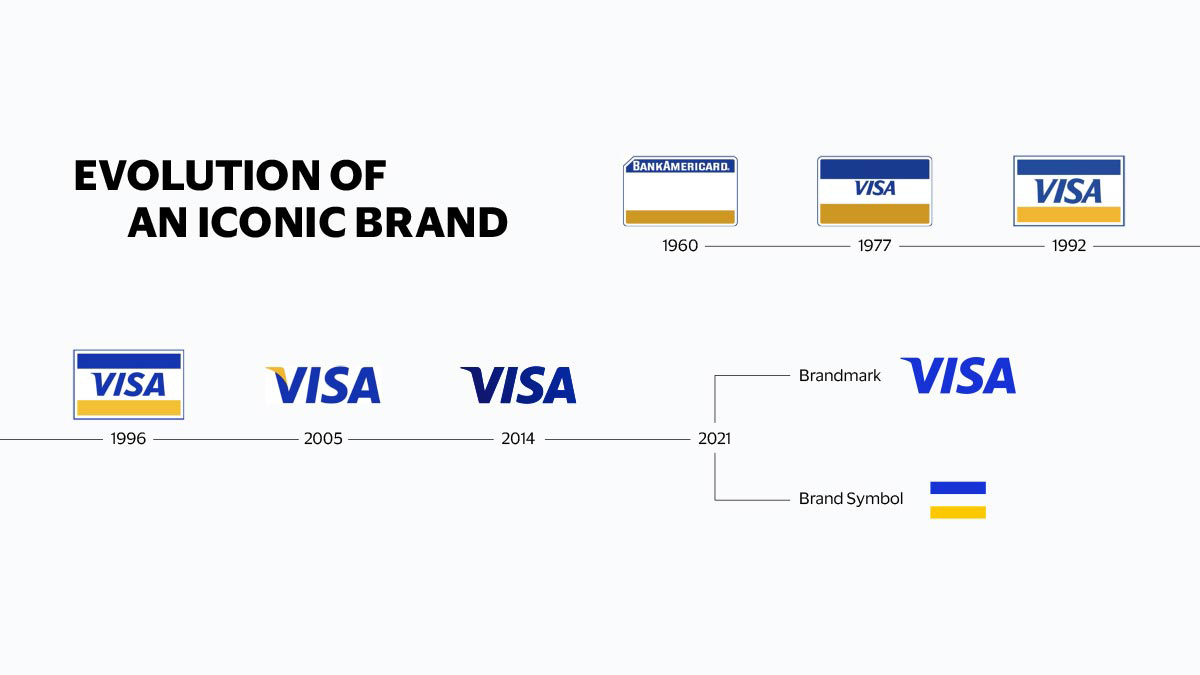
As such, the refresh brings two separate brandings: the first being a wordmark and the other being an individual blue, gold, and white emblem.
As a standalone, the brand symbol would need to catch the eye. Mucho thus brightened up Visa’s palette with a more dynamic blue, updating the brandmark’s color to match, for “digital impact.”
The new logos will debut during the Tokyo Olympic Games, before rolling out to more than 200 markets over the year.
“With the world reopening and money increasingly moving in new ways, there’s no better time to showcase the work we do and the impact a purpose-driven brand with Visa’s scale can have to enable individuals, businesses and economies to thrive,” said Biggar.
Click to view enlarged version
Click to view enlarged version. Image via Visa
Click to view enlarged version
Click to view enlarged version. Image via Visa
[via The Drum and Creative Bloq, images via Visa]
Also check out these recent news


