
How Typefaces Like Times New Roman, Gill Sans Surprisingly Got Their Names
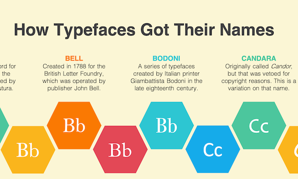
Image by Adam Aleksic and featured with permission
There are so many typefaces to choose from, you’d likely skim through them without considering their origins. Now, here’s your chance to go past the speed-dating stage and get to know them better, from A to Z.
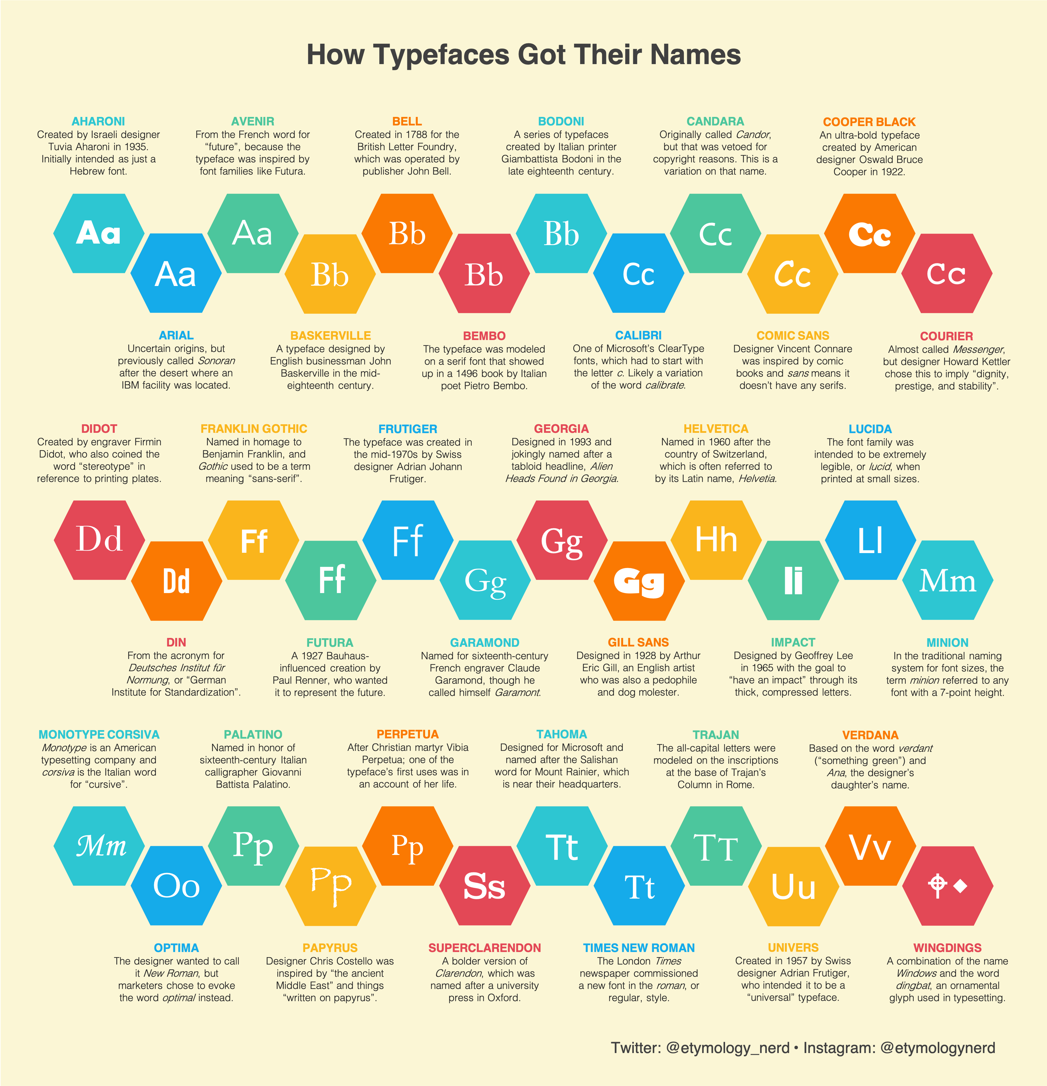
An informative graphic created by Harvard linguistics student and self-professed “etymology nerd” Adam Aleksic breaks down the naming inspirations behind some of the most popular typefaces, and they’re pretty much just as intriguing as their distinct displays.
The glimpses have caught social media media users by surprise, most especially the controversial muse behind the naming for Gill Sans.
The humanist sans-serif is named after its creator, English sculptor and typeface designer Eric Gill, who wasn’t just one of the most prolific artists of his time but was also a pedophile who had engaged in abusive, incestuous relations with his own sisters, teenage daughters, and dog—experiences he had recorded at lengths in his diaries. Gill would also express some of his suppressed desires through stone carvings.
More lightheartedly, Avenir is the French translation for “future,” and references its similarities with typefaces like Futura. In addition, Times New Roman is so-called because Britain’s Times of London newspaper had commissioned a font in the roman (regular) style. Tahoma, created for Microsoft, is the Salishan word for Mount Rainier, which is located near Microsoft’s headquarters.
Would their history change the way you use these typefaces in your projects? For more fun linguistic trivia, be sure to head over to Aleksic’s website, Instagram, and Twitter.
Image by Adam Aleksic and featured with permission
Click to view enlarged version
Click to view enlarged version. Image by Adam Aleksic and featured with permission
[via r/coolguides, images by Adam Aleksic and featured with permission]
Also check out these recent news


