
Yelp Introduces Wholly Redrawn Logo With Much More Consistent Icons

Image via Yelp Design Team
Yelp, the customer review website where online Karens seem to camp out in, is no longer giving its old logo a five-star rating. This week, the platform has unveiled a refreshed, modernized logo with icons to match; and while it has chosen to step away from a trend of flat design, the entire visual system looks a lot more streamlined.
First and foremost, did you know Yelp’s burst-shape symbol was inspired by the “star” hovering cartoon characters’ heads whenever they make a revelation? The company brought the reactive emblem to its original wordmark to signify “the moment Yelp users make a new, local discovery.” Given the context, the burst shape seems crucial to Yelp’s branding, so it’s now back in a logomark wholly redrawn from scratch.
The Yelp team reflected in a new blog post that its designers experimented with new twists on the burst symbol, including interlocking fragments of the star with the letter Y. In the end, they agreed to simply uplift the brand’s existing elements. This can be seen in the refreshed logo, illustrated from the ground up but “inspired by our original logo.”
Image via Yelp Design Team

Image via Yelp Design Team
It retains the rounded appeal of the old typeface “but with more open counters and wider curves,” resulting in a “smoother, more geometric, and proportionate” appearance.

Image via Yelp Design Team
The burst symbol, too, is now “less boxy” and more open, in line with the rounded look of the new wordmark.
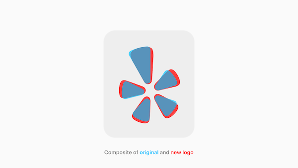
Image via Yelp Design Team
Yelp might be going down a safer route for its logo, but it’s fully invested in a whole new visual language involving its app icons. Previously, its three secondary apps—Yelp for Business, Yelp Waitlist, and Yelp Reservations—all sported different styles and a spectrum of 16 colors between them. “This was inconsistent,” Yelp admitted.
For cohesion, Yelp splashed its primary app icon in red, with white text, while the other app icons received white backgrounds, with red text.

Image via Yelp Design Team

Image via Yelp Design Team
The streamlined two-tone palette, inverted and with gradients, also ensured hierarchy would be established between the main app and the others.
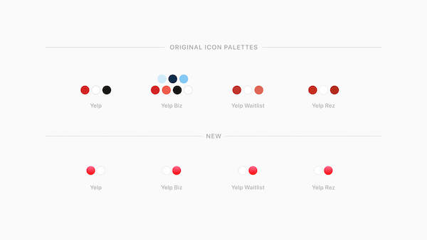
Image via Yelp Design Team
Yelp acknowledged that flat UI seems to be the “industry standard” in icon design, so it looked the other way and went 3D to be “visually distinct.”
“This glossy, embossed and rich visual language is a new style we’re excited to introduce where the texture of our app icons feel tactile and vibrantly fresh. This style is unconventional and a bold splash for a digital landscape filled with flat design,” the website teased.
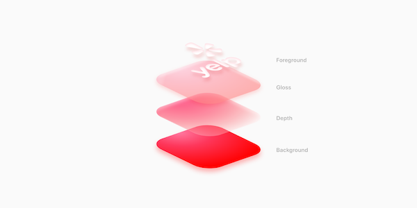
Image via Yelp Design Team

Image via Yelp Design Team
[via Yelp Design Team]
Also check out these recent news


