
The Muppets Studio Has Grown Up, And It Shows In Its Stately New Logo
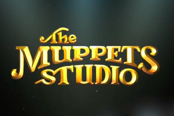
Image via The Muppets Studio
At the end of July, The Muppets Studio revealed its brand new logo on Twitter, a retro look that ties strongly back to the brand’s heritage. In a world where logos and typefaces strive to be sleeker and cleaner than ever before, this one definitely stands out.
The studio was formed in 2004 after Disney acquired The Muppets from its previous owners, The Jim Henson Company. The last logo was an intentionally wonky, playful typeface in a shade of green that can be endearingly attributed to one of the show’s stars, Kermit the Frog.
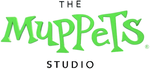
The old Muppets Studio logo. Image via Wikimedia Commons
However, the studio’s previous logo didn’t “really represent” where the studio was headed, Muppets Studio VP, Leigh Slaughter, tells ToughPigs. Now, the new black-and-gold offering “represents the early heyday of the Muppets and harkens back to a time when the nostalgia for the Muppets is very strong.”
It features “instantly recognizable” lettering reminiscent of the intro to the 1970s Muppet Show series. And the gold used is similar to the gilded interior of the Muppets’ theatre, too. “We took it a bit further by changing a few of the letters and elements so that it’s got a bit of a modern touch, as well,” Slaughter explains. “It’s part a nod to our past and part a nod to our future.”
Not a fan of the gold and black? There are more versions of the logo to come, too. Just like how the Disney logo changes in front of different films, The Muppets Studio’s logo has the potential to do so as well.
Usually, new logos mean new things are on the horizon for the brand. The Muppets Studio is no exception to this, teasing its upcoming Disney+ project, Muppets Haunted Mansion, which is coming this fall.
Curtains up on our shiny new logo for The Muppets Studio! Keep an eye out for it on new projects like Muppets Haunted Mansion this fall on Disney+. pic.twitter.com/wpUuHyq61S
— The Muppets (@TheMuppets) July 31, 2021
[via Creative Bloq, image via The Muppets Studio]
Also check out these recent news


