
Google Fonts Adds Braille Institute’s ‘Hyperlegible’ Typeface For All To Use
Image via Applied Design Works
Joining the hundreds of thoughtfully designed font families on Google Fonts is ‘Atkinson Hyperlegible’, a typeface strategically optimized for the visually impaired.
When tasked to revamp Braille Institute’s visual identity, design firm Applied Design Works took the reasonable approach of creating a wholly new typeface, poring over every detail for readability. Atkinson Hyperlegible was introduced in 2019, and the font family for low-vision readers has now been released to the masses for free on Google’s font provider, to be used not just as a web font around the internet but also to enhance legibility across documents on Google Workspace apps like Docs and Slides.
Image via Applied Design Works
You can also download it for free via the Braille Institute site.
“Making Atkinson Hyperlegible available on Google Fonts means countless more people who can benefit from its accessibility will be able to use it,” explains Braille Institute president Peter Mindnich in a press release.
To develop a typeface as clear and legible as possible, the design studio presented an array of samples to people of varying visual challenges, and then used their feedback to refine the fonts. Named after Braille Institute founder J. Robert Atkinson, the grotesque sans serif pulls from distinct elements of existing typefaces, allowing readers to distinguish characters that could traditionally be mixed up, like the capital ‘I’ and lowercase ‘L’ and ‘0’ and ‘O’.
Believe it or not, the ultimate effect of this borrowing isn’t uniformity. Rather, Atkinson Hyperlegible reflects the opposite: letterform distinction. Letters and numbers are carefully tweaked—with counters, spurs, and tails exaggerated—so no two would look alike.
Image via Applied Design Works
“Losing your vision doesn't mean having to give up on doing the things you love,” says Sandy Shin, vice president of marketing and communications at Braille Institute.
Available in 27 languages, the typeface comes with four weights plus symbols. Get it from Google Fonts.
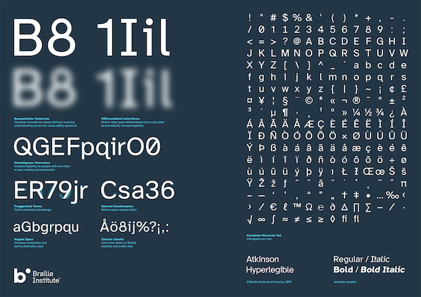
Image via Applied Design Works
Image via Applied Design Works
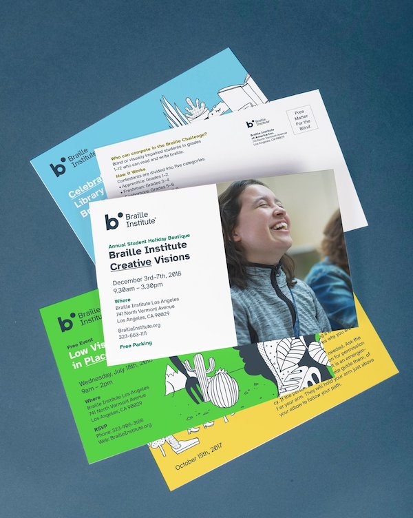
Image via Applied Design Works
[via PRINT, images via Applied Design Works]
Also check out these recent news


