
Disneyland Paris’ 30th-Anniversary Logo Is Like Fireworks For Design Lovers
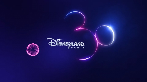
Video screenshot via Disneyland Paris
Discovering hidden Mickeys in films and theme parks is a favorite pasttime among fans. So to commemorate its 30th anniversary, Disneyland Paris embraced the tradition with a double-meaning logo that’s a huge Disney Easter egg.
Starting off the week on a magical note, Disney posted a teaser for the park’s birthday celebrations, coming to the destination on March 6, 2022. Appearing in a sky of fireworks is the number 30 and the Disneyland Paris branding, stylized in the silhouette of Mickey Mouse’s face.
We have a slight suspicion that the shapes also follow the outline of the iconic shooting star in the Walt Disney Pictures logo, since the animation concludes with an aura at the end. The look can also be seen in the Disney+ logo.
It’s the sort of logo that design enthusiasts would wish upon a star for, and the promotional visual is undoubtedly enchanting the r/DesignPorn community.
Social media users have pointed out that, rather than pulling the usual tropes of minimalism, Disney added a touch of magic by using maximalist neon. “It’s so, so much more appealing to me [than minimalism] automatically based just on the interesting materials and lighting system they used. I would really love for this to become a trend,” wrote one person. “I like when logos are somewhat intricate and, well, designed. I'm not saying anything crazy, but having it be even slightly more than basic geometry in a plain color on a plain background is something I'm happy to see.”
Disney is a master of planting Easter eggs, after all.
“Disneyland Paris’ 30th Anniversary logo. “
— The Logo Smith - Logo & Brand Identity Designer (@thelogosmith) September 6, 2021
Well this is exceptionally well executed..
I saw the number 30 first; didn’t notice it’s also Micky.
Once you see it…
→ https://t.co/6w27Et6KXB pic.twitter.com/PDLp3Yg6KE
[via r/DesignPorn, images via Disneyland Paris]
Also check out these recent news


