
Gaming Giant Bandai Namco Unveils Comic-Style Logo—But The Memes Are The Winners
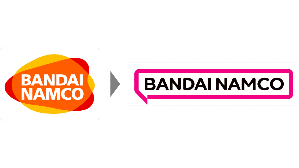
Image via Bandai Namco
Bandai Namco was one of the pioneers that cemented video gaming into the mainstream, having led successful franchises like Pac-Man, Gundam, Tamagotchi, and Tekken. However, the brand now feels that it’s due for a revival and a new purpose. So, on Friday, the company unleashed a complete logo redesign, and, with it, a refreshed vision.
The existing logomark is a fusion of the Bandai and Namco personalities during the time of their integration, describes the conglomerate in its news release, The makeover, on the other hand, embodies Bandai Namco’s all-new purpose—“Fun for All into the Future”—reflecting its wish to connect diverse groups through “the enjoyment of uniquely entertaining products and services” in hopes to help build “a brighter future.”
The transition will be adopted by “all companies with ‘Bandai Namco’ in their names,” the company elaborates. Four variations of the emblem have been created to appear effectively across all sorts of displays.
For products and services
Image via Bandai Namco
Image via Bandai Namco
For corporate materials
Image via Bandai Namco
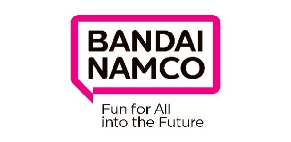
Image via Bandai Namco
Fully letting go of the red, orange, and yellow logo, Bandai Namco is hitting game-on on a fresh new era with a minimalist speech bubble. With the exception of the magenta outlining the branding, the logomark keeps things subtle with a slimmer typeface and a minimal black and white scheme.
The speech bubble motif, called Fukidashi in Japanese, draws from the nation’s manga comic culture, which Bandai Namco acknowledges has exploded worldwide. Symbolically, the use of the speech bubble represents the company’s hope to communicate with the world “and inspire [people everywhere] with amazing ideas.”
As for why it’s opting for magenta now, Bandai Namco expresses that the hue is not only “bright and fun” but it is also the color of diversity. In addition, for practical purposes, it’s “easy to reproduce.”
It could be a case of post-breakup nostalgia, but the revamp has caused quite the stir online. At least during the time of publication, looking up “Bandai Namco” on Twitter reveals a sea of disgruntled comments about the new logo, and very few positive ones.
Fans have called out the company for conforming to the trend of simplifying visual identities, with one even branding it “Blandai Namco.” Another likens the new logo to that of Dunkin’.
Here’s a positive response, which points out that the logomark’s simplicity makes it “more versatile”:
New one is a huge improvement. Much more legible, less colors, more simple and much more versatile. I never thought about it much before, but the old logo does seem very dated. Surprised they didn't update it sooner.
— Heather Auxier (@cave_comics) October 1, 2021
A few internet users aren’t 100% for the redesign, but they’ve offered some constructive advice instead of lashing out.
Bandai Namco should have used orange instead of pink for their new logo, I personally think it looks nicer and it keeps some of their old logo identity. pic.twitter.com/3R1RJig2I5
— Ethan Law🏳️🌈 (@ArchedThunder) October 1, 2021
made my own bandai namco interpretation since people are talking about the upcoming rebrand for next year
— superandrews (@usperadnre) October 1, 2021
font used courtesy of @LyricWest2 check his page out he's cool pic.twitter.com/YlKQYGQoss
If the new logo is an expression of Bandai Namco’s commitment to connect the world, well, it’s already working.
Bandai Namco is the latest victim of simplification...
— TheNCSmaster (@TheNCSmaster) October 1, 2021
Game company logos bout to look like this in the future pic.twitter.com/9IHCj7jKYi
bandai namco logo redesign be like pic.twitter.com/yFp2WYrAtj
— YUNG CHICANO SAMURAI (@sprongle69) October 1, 2021
THIS DOESN'T LOOK LIKE BANDAI NAMCO IT LOOKS LIKE DUNKIN DONUTS https://t.co/Dc5MjuZgY3
— jade, with love (@Wurpli_) October 1, 2021
I really don't hate the Bandai Namco new logo or anything but it looks more like something I'd see on a gossip site pic.twitter.com/HsGr2mYoJP
— Caitlyn (@Caitlyndrawsit) October 1, 2021
[via Gematsu, images via Bandai Namco]


