
Quirky Font Patented In 1909 Can Be Read Forward & Backward To ‘Lessen Fatigue’
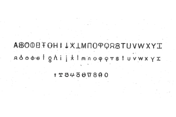
Image via Scott H. Perky (public domain)
Have you ever squinted at a line of text printed backward, trying to form a full left-to-right sentence while reading right-to-left? Arguably, it might not be the most efficient way to set out text although it’s the only way English has known.
In 1909, Scott H. Perky from Niagara Falls decided that this had to change. He filed a patent for a revolutionary typeface that would allow words to be written forward or backward without needing to change the characters’ direction.
This is thanks to each character having a vertical line of symmetry.
Consequently, you could read it from either way too. One suggested use is to print a document with this typeface, then read the first line from left to right as usual, before continuing straight down to the next line, reading it right to left. Just imagine reading this paragraph in a zig-zag manner.
This, he argued, would reduce eye strain when reading large chunks of text. “To students, researchers and others whose lives are cast among books, any device which promises to facilitate reading in such wise as to lessen fatigue of the optical tract, and consequent headache and brain fag, will appear of unusual importance,” he wrote in the patent.
It’s worth noting that “brain fag” was a term derived from “brain fatigue” and used widely in the late 19th, early 20th century to describe mental exhaustion similar to neurasthenia.
Some “disadvantages” of normal reading, according to Perky, are “the irrelative exercise of the brain in finding the beginning of the new line while remembering the connection of the text” and “the rapidly recurring reversions of the eyeballs in skipping backward, which may be compared in effect to the rapid flashes of alternate light and dark through a paling fence as one passes by at high speed.”
This system of writing isn’t entirely new, even for 1909. David Wilder points out for Beach Packaging Design that it draws on the concept of Boustrophedon, a way of inscribing text onto stone in ancient Greece. The word itself, βουστροφηδόν, means “to turn like oxen,” a reference to plowing.
Visualizing this entire article in a bi-directional font is not an easy feat. Imagine studying for an exam with all the material printed like this. But maybe if it had caught on when the patent was filed, we’d all be used to it by now.
[via Boing Boing, image via Scott H. Perky (public domain)]
Also check out these recent news


